Software Engineer & Educator
Data Visualization First Steps

3 hours, 27 minutes
CC
Course Description
Instead of staring at spreadsheets of data, you can turn that data into something visual and interactive! It allows you to explore and answer questions about the information quickly. In the course, you'll build hands-on projects with the Observable Plot library. You'll make visualizations or plots, add interactivity and embed your plots around the web with JavaScript and frameworks like React. By learning these fundamentals, you'll be able to have what you need to move on to more complex work with d3.js and beyond!
Preview
Course Details
Published: June 7, 2022
Rating
Learning Paths
Learn Straight from the Experts Who Shape the Modern Web
Your Path to Senior Developer and Beyond
- 300+ In-depth courses
- 24 Learning Paths
- Industry Leading Experts
- Live Interactive Workshops
Table of Contents
Introduction
Section Duration: 2 minutes
 Anjana Vakil introduces the course by providing personal background, course resources, and a brief overview of the Observable course website.
Overview
Section Duration: 50 minutes
 Anjana discusses the benefits for developers to utilize data visualization, including feature development, performance, and code and collaboration efficiency. Using graphical information to convey information allows individuals to discover meaning and patterns in data quickly.
 Anjana answers a student's question regarding choosing appropriate graph colors and discusses various use-cases for data visualization. The student-provided use-cases addressed in this segment include healthcare, Apple watch data, retail office data tracking, and the legal field.
 Anjana discusses using Observable for in-browser data visualization and walks through the base steps to start visualizing data. Getting the base data, reshaping data, and visualizing the data are discussed in this segment.
 Anjana provides some JavaScript tools for data visualization and discusses their functions. D3.js, Vega-Lite, Arquero, and tidy.js are discussed in this segment.
 Anjana discusses the grammar of graphics as a system for understanding the abstraction of data visualization into core concepts and discusses an overview of the course content. Marks, scales, transforms, and facets are core concepts discussed in this segment.
Data Attributes
Section Duration: 37 minutes
 Students are instructed to use fill color to visualize test conclusions and use more easily recognizable colors. The provided chart will become more informative using additional channels to express other data properties.
 Anjana walks through the solution to the setup project data in plot exercise.
 Students are instructed to set the domain and rage colors in the provided chart using fill opacity to visualize test duration.
 Anjana walks through the solution to the setting domain and range colors exercise.
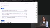 Anjana demonstrates how to add tooltips to a chart to display more details. In this case, each tooltip will display the job's conclusion status and duration.
Analytics
Section Duration: 54 minutes
 Anjana walks through the content of the "What size devices are users browsing with?" project. Students are then instructed to transform the deviceAnalytics array into a new devices array with the numeric values and additional columns and create a new array based on the devices data that adds "width" and height" columns.
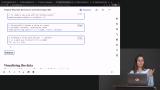 Anjana walks through the solution to the wrangle the data exercise and how to use Plot's Group transform functions to aggregate data based on a categorical property to compute values in each category.
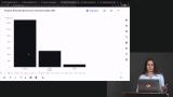 Students are instructed to use the previous plot example and specify the group's transform inputs and outputs to calculate the sum of all users in each category and visualize the result on the y axis.
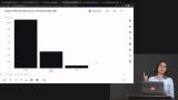 Anjana walks through the solution to the aggregation and grouping exercise.
 Students are instructed to create a scatterplot, plot screen width on the x-axis and height on the y-axis, use other channels to visualize the device category and number of sessions, and as a bonus, try to add informative tooltips to get more details by hovering over a dot.
 Anjana walks through the solution to the scatterplot exercise.
 Students are instructed to arrange the facets horizontally along the x-axis, use the previously used devices data for the facets and use the device type (mobile, tablet, desktop) to create the facets.
 Anjana walks through the solution to the facets for comparing group data exercise.
API Responses
Section Duration: 50 minutes
 Anjana discusses the content of the "How fast are API responses" project and provides a brief exercise regarding setting up the initial response time plot graph.
 Anjana walks through the solution to the plot response times exercise and demonstrates some Observable Inputs HTML widgets that allow for the addition of interactive controls to data visualizations. A brief demonstration of the checkbox widget is also provided in this segment.
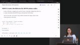 Students are instructed to create checkboxes that filter for some/all of the present HTTP status codes.
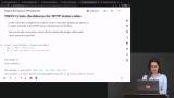 Anjana walks through the solution to the filtering the data exercise.
 Students are instructed to create a dot plot showing the response durations of requests over time. Try to use a color channel to visualize the paths of the requests and add informative tooltips to get more details by hovering over a dot.
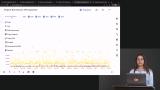 Anjana walks through the solution to the plotting the filtered the data exercise.
 Students are instructed to create a search input to search the apiLogData and manually use the provided cell's Table input to verify that the search returns the expected results. Then, copy the previously completed dot plot (or the reference solution) code into the following cell, and connect it to the search input to allow viewers to search by path names.
 Anjana walks through the solution to the search box exercise.
 Anjana demonstrates several alternatives for sharing data visualizations, including Observable, vanilla JavaScript projects, and React projects. Sandboxes with example code are also provided in this segment.
Wrapping Up
Section Duration: 10 minutes
 Anjana wraps up the course by reviewing the content covered, providing some key takeaways, and discussing the next steps for data visualizations.
Earn a Completion Certificate
After completing this course, you'll receive a certificate of completion that serves as proof of your achievement, showcasing your expertise, and commitment to professional development. You can easily share this certificate on your LinkedIn profile to highlight your new skills and demonstrate continuous learning to potential employers and professional connections.