AVAILABLE NOW: Front-End Developer Handbook 2017
Learn Multi-Thing Development

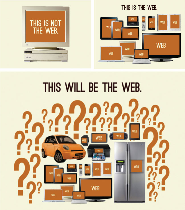
Image source: http://bradfrost.com/blog/post/this-is-the-web/
A site or application can run on a wide range of computers, laptops, tablets and phones, as well as a handful of other things (watches, thermostats, fridges, etc.). How you determine what things you'll support and how you will develop to support those things is called a multi-thing development strategy. Below, I list the most common multi-thing development strategies.
- Build a responsive (RWD) web site/app for all things.
- Build a RESS (responsive web design with server-side components) web site/app for all things.
- Build an adaptive/progressively enhanced web site/app for all things.
- Build a website, web app, native app, or hybrid-native app for each individual thing or a grouping of things.
- Attempt to retrofit something you have already built using bits and parts from strategies 1, 2 or 3. This could be as simple as sprinkling in some screen-size agnostic UI parts or attempting to fully support other things with the entire UI.
General Learning:
- Adaptive Web Design [read][$]
- Designing Multi-Device Experiences: An Ecosystem Approach to User Experiences across Devices [read][$]
- Designing with Progressive Enhancement [read][$]
- Mobile Web Development [watch]
- Responsive HTML Email Design [watch][$]
- Responsive Images [watch]
- Responsive Typography [watch][$]
- Responsive Web Design [watch][$]
- Responsive Web Design Fundamentals [watch]