Continue Course
Nice Work!
You have completed Enterprise Web App Accessibility (feat. React)
|
|
Enterprise Web App Accessibility (feat. React)
Learn to bake accessibility into your development process and culture. Understand UI accessibility, ARIA, focus management, and how to test for accessible web apps. Through hands-on exercises, you'll tackle optimizing components for screen readers and keyboards, utilizing semantic HTML, and understanding JavaScript's impact on accessibility. Foster an accessibility-focused culture within your development teams, equipping you with the knowledge to build inclusive web applications!
Course Progress
Lessons Completed
0
Lessons Remaining
0
Time Remaining
0 hr 0 min
0% completed
0% remaining
Course Detail
Published: February 27, 2024
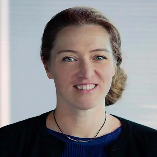
Marcy Sutton Todd
Marcy Sutton Todd is a Senior Engineer on the Frontend Infrastructure team. In her 15+ year career Marcy has worked as an accessibility engineering consultant, taught workshops, led the Learning team at Gatsby, worked on the axe-core and Angular frameworks, and much more. Marcy’s focus on access and user experience was recognized by O’Reilly in 2016 with a Web Platform Award. When away from the keyboard, Marcy can be found caring for her family, exploring mountains, lifting heavy weights, and cooking yummy food.