You might think the job of putting an inset shadow on an <img> is trivial: just set a box-shadow like inset 0 1px 3px and that’s it!
You’d be wrong.
This doesn’t work because the actual image is content for the img element. And content is painted on top of box-shadow.
This problem is something that has been the topic of countless questions on Stack Overflow as well as Reddit and other places on the internet. It has also been covered in many articles over the past 15 years. Now in 2025, it still made the list of pain points when dealing with shapes & graphics according to the State of CSS survey.
So why yet another article? Well, almost all the solutions I’ve seen so far involve at least another element stacked on top of the img (assuming they don’t straight up replace the img with a div), so that we can have a “cover” with the exact dimensions on top – this is the (pseudo)element that actually gets the inset shadow. Beyond using at the very least an extra pseudo-element for each image, this can be annoying for users, as the right click img menu is lost unless the “cover” gets pointer-events: none.
I want to show you a solution that allows us to add the shadow directly on <img> elements without requiring an extra wrapper or sibling for each.
This article is going to have two parts, the first (current one) going into a lot of detail about the how behind creating the basic inset black shadow with offsets, blur and spread radii and the second being a deep dive into pain points like painting the shadow and limitations tied to length values.
Base setup
We have just an img element:
<img src='my-image.jpg' alt='image description'>Code language: HTML, XML (xml)And a simple SVG filter:
<svg width='0' height='0' aria-hidden='true'>
  <filter id='si'>
  </filter>
</svg>Code language: HTML, XML (xml)
Wait, don’t run away screaming!
I promise that, while SVG filters may seem scary and this technique has some limitations and quirks, it’s still easy to digest when going through it step by step, each step having interactive demos to help with understanding how things work in the back. By the end of it, you’ll have a bunch of cool new tricks to add to your web dev bag.
So let’s get started!
First off, our SVG filter needs to be inside an svg element. Since this element only exists to contain our filter, it is not used to display any graphics, it is functionally the same as a style element. So we zero its dimensions, hide it from screen readers and take it out of the document flow from the CSS:
svg[height='0'][aria-hidden='true'] { position: fixed }Code language: CSS (css)We then apply our filter on the img element:
img { filter: url(#si) }Code language: CSS (css)Note that the filter as it is at this point causes the img to disappear in Firefox, even as it leaves it unchanged in Chrome. And, according to the spec, an empty filter element means the element the filter applies to does not get rendered. So Firefox is following the spec here, even if the Chrome result is what I would have expected: an empty filter being equivalent to no filter applied.
The base filter content
Offset the alpha map
We start off by offsetting the alpha map of the filter input, the filter input being our img in this case. The alpha map is basically the filter input where every single pixel has its RGB channels zeroed and its alpha channel preserved.
Since here the filter input is a plain rectangular, fully opaque image, the alpha map (referenced within the SVG filter as SourceAlpha) is a fully opaque black rectangle within the boundary of our initial image, while everything around it is fully transparent. Note that if the img has a border-radius (with any kind of corner-shape), then the alpha map is going to respect that too.
<svg width='0' height='0' aria-hidden='true'>
  <filter id='si'>
    <feOffset in='SourceAlpha' dx='9' dy='13'/>
  </filter>
</svg>
Code language: HTML, XML (xml)
These fe-prefixed elements inside our filter (“fe” stands for “filter effect”) are called filter primitives. They may have zero, one, or two inputs. Primitives with zero inputs create a layer based on their other attributes (for example, feTurbulence can give us a noise layer based on a baseFrequency attribute). Primitives with one input (like feOffset here) modify that input. And finally, primitives with two inputs combine them into one result (for example, feBlend blends its two inputs using the blend mode given by its mode attribute).
All of those needed for the base filter creating a simple inset black shadow have either one or two, though when we get to painting the shadow and other effects, we may need to use some with no inputs.
For most of those with a single input, we don’t specify that input explicitly (by setting the in attribute) because we’re using the defaults! Filter primitive inputs are by default the result of the previous primitive or, in the case of the very first primitive, the filter input (referenced within the SVG filter as SourceGraphic).
feOffset in particular offsets its input along the x and/or y axis. In our particular case, it offsets its input by 9px along the x axis and by 13px along the y axis.
The following interactive demo illustrates how this primitive works and allows changing the feOffset attributes to see how that affects the visual result.
Note that the in attribute and the offset ones (dx and dy) are greyed and crossed out when set to SourceGraphic and 0 respectively. It’s because these are the default values and if they are the values we want for them, then we don’t need to set them at all.
Blur the offset map
Next, we blur this offset result.
<svg width='0' height='0' aria-hidden='true'>
  <filter id='si'>
    <feOffset in='SourceAlpha' dx='9' dy='13'/>
    <feGaussianBlur stdDeviation='5'/>
  </filter>
</svg>
Code language: HTML, XML (xml)
Adding this second primitive is equivalent to chaining blur(5px) after the filter we had at the previous step (with only the feOffset primitive).
Note that this blur radius (and any SVG blur radius in general, whether it’s a stdDeviation attribute of an SVG filter primitive or a blur radius used by CSS equivalents like the blur() or drop-shadow() functions) needs to be half the one we’d use for a box-shadow if we want the same result. You can check out this article by David Baron for a detailed explanation of the why behind.
The interactive demo below lets us play with the filter we have so far (all primitive attributes can be changed) in order to get a better feel for how it works.
Note that these first two primitives can be in any order (we get the exact same result if we apply the offset after the blur). However, this is generally not the case — in most cases, the order of the primitives does matter.
Also note that in some scenarios (for example if we increase the blur radius to the maximum allowed by the demo), the blur seems cut off from a certain point outside the input element’s boundary. This cutoff is where the filter region ends.
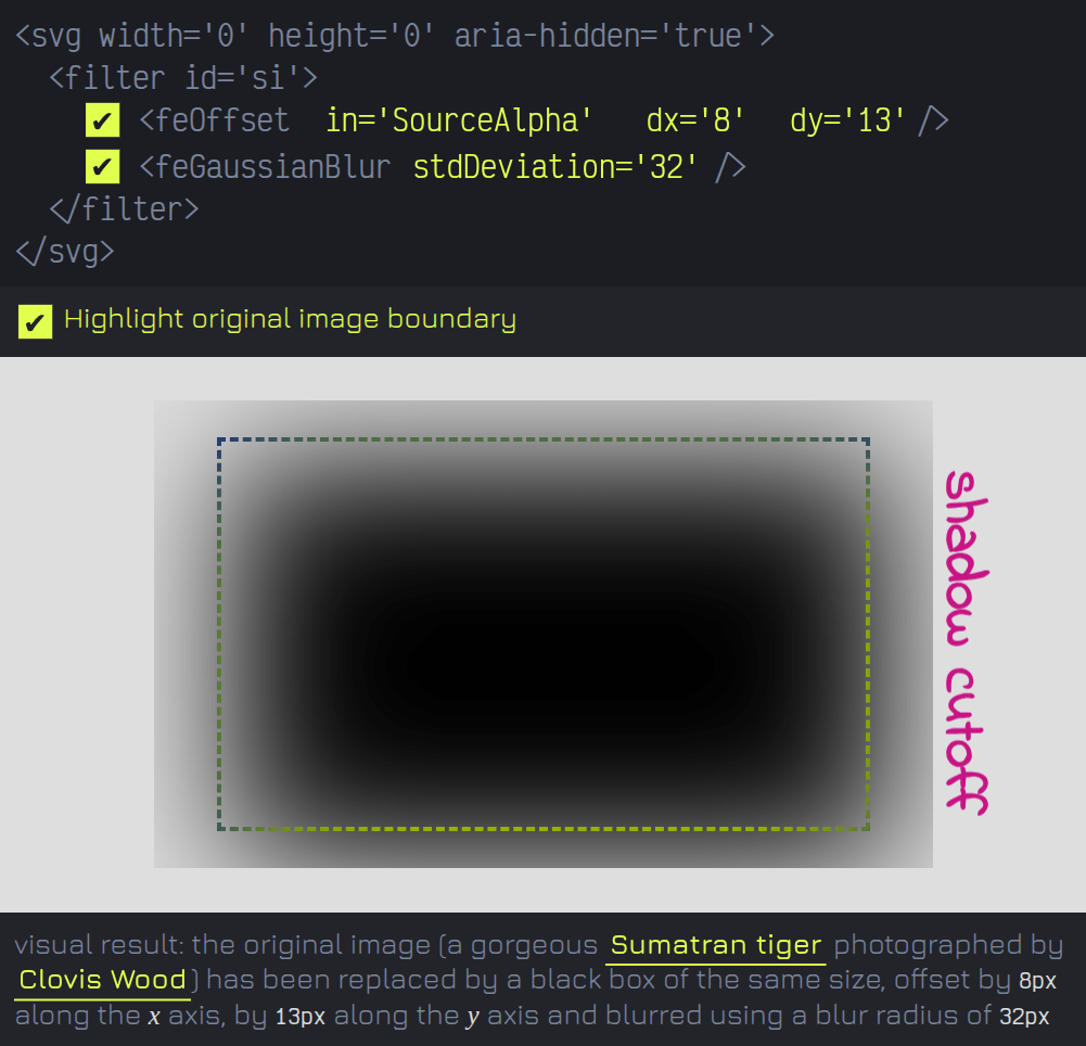
By default, the filter region extends 10% of the filter input’s bounding box size in every direction. In the case of a rectangular image, the bounding box is the image rectangle, the one whose boundary is marked by a dashed line in the interactive demos above.
We can change this region by changing the x, y, width and height attributes of the filter element. By default, these are given relative to the width and height of the filter input’s bounding box, using either a percentage or decimal representation. We could change the value of the filterUnits attribute to make them fixed pixel values, but I don’t think that’s something I’ve ever wanted to do and the default of them being relative to the filter input’s bounding box is what we want here, too.
For example, x='-.25'and x='-25%' are both valid and produce the same result. In this case, the filter region starts from 25% of the input bounding box width to the left (negative direction) of the left edge of this bounding box. The interactive demo below allows toying with the filter region too.
However, since our desired effect, the basic inset shadow, is limited to the area of the filter input (that is, the area of the original image), we don’t care if anything outside it gets cut off by the filter region limit, so we won’t be touching these filter attributes. At least for now, as long as we’re talking just about the base inset shadow.
Subtract offset & blurred version from initial one
The next step is to subtract the alpha of this offset and blurred result from the original alpha map (SourceAlpha) with no offset or blur applied:
<svg width='0' height='0' aria-hidden='true'>
  <filter id='si'>
    <feOffset in='SourceAlpha' dx='9' dy='13'/>
    <feGaussianBlur stdDeviation='5'/>
    <feComposite in='SourceAlpha' operator='out'/>
  </filter>
</svg>
Code language: HTML, XML (xml)
feComposite is a primitive with two inputs (in and in2, both defaulting to the result of the previous primitive). When we use feComposite with the operator attribute set to out, we subtract the second input (in2, not set explicitly here as we want it to be the result of the previous primitive) out of the first one (in).
This isn’t plain clamped subtraction. Instead, it’s similar to what subtract (source-out in the ancient, non-standard WebKit version) does when compositing alpha mask layers: the alpha of the first input in (α) is multiplied with the complement of the second input in2 alpha (α₂).
This means that for every pair of corresponding pixels from the two inputs, the RGB channels of the result are those of the pixel from the first input (in), while the alpha of the result is given by the following formula:
α·(1 – α₂)
Where α is the alpha of the pixel from the first input in, and α₂ is the alpha of the corresponding pixel from the second input in2, the input we subtract out of the first to get a black inset shadow.
Note that this latest interactive demo disables the option to switch between SourceAlpha and SourceGraphic inputs for the feOffset primitive. This is due to a Firefox bug which we might hit in certain situations and which makes the result of the feComposite simply disappear if feOffset uses the default SourceGraphic input.
Switching the operator also isn’t enabled here, as it would mean just too much to unpack and most is outside the scope of this article anyway. Just know that some of the operator values work exactly the same as their CSS mask-composite equivalents.
For example, over is equivalent to add (source-over in the ancient, non-standard WebKit version), subtracting the alpha product from their sum (α + α₂ - α·α₂).
Then in is equivalent to intersect (source-in), multiplying the alphas of the two inputs (α·α₂).
And xor is equivalent to exclude, where we add up the result of each of the two inputs being subtracted from the other (α·(1 – α₂) + α₂·(1 – α)).
For more details and visual examples illustrating how these operators work, you can check out this page (note that all operator values used for feComposite are source-* ones, for the effect given by the destination-* ones, we need to reverse the two inputs).
Place the initial image underneath
Now that we have the shadow, all we still need to do is place the filter input (the image in our case) underneath it. I’ve often seen this done with feMerge or feComposite. I personally prefer to do it with feBlend as this primitive with the default mode of normal produces the exact same result as the other two. Plus, other modes may offer us even more visually interesting results.
<svg width='0' height='0' aria-hidden='true'>
  <filter id='si'>
    <feOffset in='SourceAlpha' dx='9' dy='13'/>
    <feGaussianBlur stdDeviation='5'/>
    <feComposite in='SourceAlpha' operator='out'/>
    <feBlend in2='SourceGraphic'/>
  </filter>
</svg>
Code language: HTML, XML (xml)
Just like feComposite, feBlend takes two inputs. in is the one on top and we don’t need to set it explicitly here, as it defaults to the result of the previous primitive, the inset shadow in our case. This is exactly the layer we want to have on top here. in2 is the one at the bottom and we set it to the filter input (SourceGraphic), which is the image in our case.
A base case example
This is exactly the technique we used to create the inner shadows on these squircle-shaped images.

Note that the squircle shape seems to be incorrect in Safari (tested via Epiphany on Ubuntu), but the relevant part (the inset shadow) seems to work well everywhere. Also, nowadays, this is not the simplest way to create squircle shapes anymore with the corner-shape property as well as the shape() function making their way into browsers, but it’s still a way to do it and, leaving aside bugs like the incorrect squircle Safari issue, a better supported one.
Spread it out: how to get a spread radius this way
The box-shadow property also allows us to control a fourth length value beside the offsets and the blur radius: the spread radius. To get the same effect with an SVG filter, we either erode or dilate the alpha map (SourceAlpha) using feMorphology.
<svg width='0' height='0' aria-hidden='true'>
  <filter id='si'>
    <feMorphology in='SourceAlpha' operator='dilate' radius='5'/>
  </filter>
</svg>
Code language: HTML, XML (xml)
When using the dilate operator, what feMorphology does is the following: for every channel of every pixel, it takes the maximum of all the values of that channel for the pixels lying within the specified radius (from the current pixel) along both the x and the y axes in both the negative and positive direction.
Below, you can see how this works for a channel whose values are either maxed out (1) or zeroed (0). For every pixel of the input (green outline around the current one), the corresponding output value for the same channel is the maximum of all the values for that channel within a radius of 1 from the current pixel (within the red square).
In our case, things are made simpler by the fact that the input of this primitive is the alpha map of the filter input (SourceAlpha). Each and every single one of its pixels has the RGB values zeroed, so it basically doesn’t change anything on the RGB channels. The only thing that changes is the alpha channel at the edges, which is again made simpler by the fact that our input is a rectangular box (the alpha is 1 within the rectangle boundary and 0 outside), so for a radius of 1, our black box grows by 1px in every one of the four directions (top, right, bottom, left), for a radius of 2 it grows by 2px in every direction and so on.
When using the erode operator, feMorphology takes the minimum of all the values of each channel for the pixels lying within the specified radius (from the current pixel) along both the x and the y axes in both the negative and positive direction.
Below, you can see a similar recording to the dilation one, only this time it’s for erosion. For every pixel of the input (green outline around the current one), the corresponding output value for the same channel is the minimum of all the values for that channel within a radius of 1 from the current pixel (within the red square).
So in our particular case, erosion means that for a radius of 1, our black box shrinks by 1px in every one of the four directions (top, right, bottom, left), for a radius of 2 it shrinks by 2px in every direction and so on.
Just for fun, the interactive demo above allows switching between SourceAlpha and SourceGraphic. This is completely irrelevant in the context of this article, but it was a little low effort extra that allows seeing the effect of this primitive on the RGB channels too.
Since erode is a min() result where the lowest channel value wins, this operation darkens our input. Since dilate is a max() result where the highest channel value wins, this operation brightens our input. Also, they both create squarish shapes, which makes sense given the how behind, illustrated in the videos above. Basically, in the dilate case, every pixel brighter than those around it expands into a bigger and bigger square the more the radius increases; and in the erode case, every pixel darker than those around it expands into a bigger and bigger square as the radius increases.
So if we introduce this feMorphology primitive before all the others in our inset shadow filter (keep in mind this also means removing the in='SourceAlpha‘ attribute from feOffset, as we want the feOffset input to be the feMorphology result and, if we don’t explicitly set the in attribute, it defaults to the result of the previous primitive), it’s going to allow us to emulate the spread radius CSS provides for box-shadow.
<svg width='0' height='0' aria-hidden='true'>
  <filter id='si'>
    <feMorphology in='SourceAlpha' operator='dilate' radius='3'/>
    <feOffset dx='9' dy='13'/>
    <feGaussianBlur stdDeviation='5'/>
    <feComposite in='SourceAlpha' operator='out'/>
    <feBlend in2='SourceGraphic'/>
  </filter>
</svg>
Code language: HTML, XML (xml)Note that here we may also change the order of the feMorphology and feOffset primitives before the feGaussianBlur one and still get the same result, just like we may also change the order of the feOffset and feGaussianBlur primitives after the feMorphology one. However, the feMorphology primitive needs to be before the feGaussianBlur one, as having the feGaussianBlur primitive before the feMorphology one would give us a different result from what we want.
Unlike the CSS spread radius used by box-shadow, the radius attribute can only be positive here, so the operator value makes the difference, each of the two giving us a result that’s equivalent to either a positive CSS spread radius or a negative one.
Since the dilated/eroded, offset and blurred alpha map is subtracted (minus sign) out of the initial one for an inset shadow, the erode case corresponds to a positive spread radius, while the dilate case corresponds to a negative one.
If we were to use a similar technique for an outer shadow, where the dilated/eroded, offset and blurred alpha map would be the shadow itself, wouldn’t be subtracted out of anything (so plus sign in this case), the erode case would correspond to a negative spread radius and the dilate case to a positive one.
A fancier example
We can take it one step further and not only have an inner shadow with a spread, but also add a little touch that isn’t possible on any element with CSS alone: noise! This is done by displacing the inset shadow using a noise map, similar to how we create grainy gradients.