AnnieCannons
CSS Projects

5 hours, 1 minute
CC
Course Description
Looking to practice your CSS skills? Work through five distinct projects to practice writing semantic HTML, mobile-first designs, media queries, and CSS layout techniques. You'll leverage CSS variables, flexbox and grid, inheritance, and responsive design strategies for supporting multiple device form factors. By completing these projects, you'll gain the confidence and refine your skills to tackle any HTML and CSS challenge in your professional path!
This course and others like it are available as part of our Frontend Masters video subscription.
Preview
CloseWhat They're Saying
I just completed "CSS Projects" by Jen Kramer on Frontend Masters! Thanks; It's a great course, and I really learned valuable approaches to building websites.

Suresh Pradhana
suresh_pradhana
It was interesting to try to do all the projects on your own, I hope there will be more courses like this. A lot of CSS key concepts are covered.

Zeljko Krsic
zeljko_krsic1
Learn Straight from the Experts Who Shape the Modern Web
Your Path to Senior Developer and Beyond
- 200+ In-depth courses
- 18 Learning Paths
- Industry Leading Experts
- Live Interactive Workshops
Table of Contents
Introduction
Section Duration: 8 minutes
 Jen Kramer introduces the course by providing an overview of the course material and answering student questions regarding frameworks, the latest CSS features, and how to practice CSS. Each course project is broken into 4 steps: study the screenshots, semantic HTML, mobile layout, and additional layouts.
Style Guide Project
Section Duration: 50 minutes
 Jen walks through a screenshot of a finished version of the Style Guide project and the starting CodePen content. Students are instructed to complete the instructions for the Style Guide challenge 1A.
 Jen walks through the solution to the font and font sizes portion of the Style Guide project. Creating a font scale, CSS variables, and utilizing calc() is also covered in this segment.
 Jen demonstrates styling the image and links in the Style Guide project, including the image size and rounding the image corners. Inheritance, the box model, and styling the header are also covered in this segment.
 Jen adds a highlight color with a gradient to the fancy-text class and adds styling to the color blocks. The selector for all immediate children and border-box sizing are also discussed in this segment.
Columns & Cover Project
Section Duration: 1 hour, 4 minutes
 Jen walks through a screenshot of a finished version of the Columns & Cover project and the starting CodePen content. Students are then instructed to write the semantic HTML for challenge 1B.
 Jen walks through defining the Column and Cover project's semantic HTML and answers a student's question regarding the target attribute. Semantic HTML elements clearly describe the meaning of their contents in a human and machine-readable way.
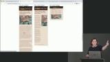 Jen instructs students to define the mobile layout for the Column and Cover project and then walks through the solution. Student questions regarding if grid can have dynamic rows, changing a grid item's display order, and using a figure instead of a div element are also covered in this segment.
 Jen instructs students to utilize media queries and create the tablet version of the application. The solution to the tablet layout and student questions regarding object-fit and object-position are also provided in this segment.
 Jen instructs students to define the CSS for the desktop version of the application and then walks through the solution. Utilizing grid columns to automatically divide text and what happens when a selector is in two different breakpoints is also covered in this segment.
Background & Overflow Project
Section Duration: 49 minutes
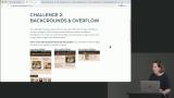 Jen walks through some features of the finished version of the Background and Overflow project and instructs students to write the semantic HTML for the Backgrounds and Overflow project. The solution for the semantic HTML is also covered in this segment.
 Jen instructs students to create the default mobile layout for the application. The solution to the mobile layout and the accessibility of hiding elements are also covered in this segment.
 Jen demonstrates how to have the scrollbar on the wrapper instead of the browser window. Creating a custom scrollbar for both WebKit browsers and Firefox is also covered in this segment.
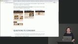 Jen instructs students to utilize media queries and define the tablet layout of the application. The solution to the media queries exercise is also covered in this segment.
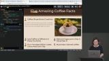 Jen walks through defining the desktop layout of the application utilizing media queries and a grid-based layout.
Grid Project
Section Duration: 33 minutes
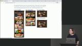 Jen walks through screenshots of a finished version of the Wacky Grid project and gives a hint about how to approach the desktop layout. Students are then instructed to complete the semantic HTML and the solution is walked through.
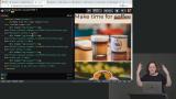 Jen discusses some key features of the mobile layout and instructs students to create the mobile layout for the Wacky Grid. The solution to the mobile layout is also covered in this segment.
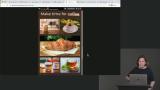 Jen demonstrates the layout changes between the mobile layout and the tablet layout and instructs students to complete the tablet layout. The solution for the tablet layout is also provided in the segment.
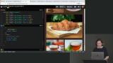 Jen discusses utilizing a configuration grid to help decide the image locations and instructs students to complete the Wacky Grid desktop layout. The solution to the desktop layout is also covered in this segment.
Team Project
Section Duration: 39 minutes
 Jen walks through key features of the Quirky Team project, including circle images, social media icons, and utilizing the z-index.
 Jen instructs students to complete the semantic HTML markup for the Quirky Team project. The solution to the Quirky Team semantic HTML is also covered in this segment.
 Jen discusses the Quirky Team mobile layout and instructs students to define the CSS for round images and text styling. The solution for the mobile layout, not including the icons, is also covered in this segment.
 Jen walks through styling and positioning the social media icons for the Quirky Team mobile layout. The icons are positioned by utilizing pseudo-classes and absolute positioning.
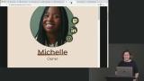 Jen instructs students to complete the CSS for both the tablet and desktop layouts. A student's question regarding the order of icon pseudo-classes is also covered in this segment.
Cards Project
Section Duration: 52 minutes
 Jen walks through the final versions of the Outrageous Cards layouts and points out key features of each layout to keep in mind when writing the CSS styling.
 Jen asks students to consider the various effects when grouping semantic elements and instructs students to write the semantic HTML markup for the Outrageous Cards. A possible solution the the semantic HTML markup is also covered in this segment.
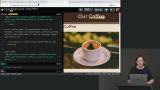 Jen instructs students to complete the mobile portrait layout for the Outrageous Cards project. The solution for the mobile portrait layout is also covered in this segment.
 Jen instructs students to complete the layout for the mobile landscape breakpoint. The transform property or writing mode in CSS logical properties could possibly be used to rotate the text. The solution to the mobile landscape layout is also covered in this segment.
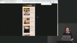 Jen instructs students to complete the tablet layout for the Outrageous Cards project. The solution to the tablet layout is also covered in this segment.
 Jen discusses key features of the Outrageous Cards desktop layout and instructs students to complete the CSS for the desktop layout. The solution for the desktop layout, which utilizes flexbox, is also covered in this segment.
Wrapping Up
Section Duration: 2 minutes
 Jen wraps up the course by providing suggestions for adding to the course challenges, next steps for learning CSS, CSS references, and more courses to check out on Frontend Masters.
Learn Straight from the Experts Who Shape the Modern Web
- In-depth Courses
- Industry Leading Experts
- Learning Paths
- Live Interactive Workshops