

No one loves dancing hamster GIFs more than I do. But all those animated frames can add up to files so large you don’t even see the dancing hamster. Your other tab has already loaded and you’ve followed the dopamine hits down another social media rabbit hole.
There’s an alternative for those giant animated GIFs: animated SVGs.
Along with much smaller file size you also get infinite scalability and the use of some — though, sadly, not all — media queries. Let’s take a look.
Warning: some of the animations in this article do not use a prefers-reduced-motion media query. We’ll discuss why that is later in the article.
How it works
First let’s create a simple rhombus in SVG. You could do a square, but rhombus is more fun to say.
<svg xmlns="http://www.w3.org/2000/svg" xml:space="preserve" fill-rule="evenodd" stroke-linejoin="round" stroke-miterlimit="2" clip-rule="evenodd" viewBox="0 0 500 500">
  <path id="rhombus" fill="#fc0000" d="m454 80-68 340H46l68-340h340Z"/>
</svg>Code language: HTML, XML (xml)
Next let’s do a quick spinning motion that we’ll run infinitely.
#rhombus {
  transform-origin: center;
  rotate: 0deg;
  animation: spinny-spin 3.5s forwards infinite ease-in-out;
}
@keyframes spinny-spin {
  0% {
    rotate: 0deg;
  }
  90%, 100% {
    rotate: 720deg;
  }
}Code language: CSS (css)We’ve done this as essentially a separate CSS file that looks into the SVG to style parts of it. We could pluck up that CSS and put it right inside the <svg> if we wanted. SVG is cool with that.
<svg xmlns="http://www.w3.org/2000/svg" xml:space="preserve" fill-rule="evenodd" stroke-linejoin="round"
    stroke-miterlimit="2" clip-rule="evenodd" viewBox="0 0 500 500">
    <style>
        #rhombus {
            transform-origin: center;
            rotate: 0deg;
            animation: spinny-spin 3.5s forwards infinite ease-in-out;
        }
        @keyframes spinny-spin {
            0% { rotate: 0deg; }
            90%, 100% { rotate: 720deg; }
        }
    </style>
    <path id="rhombus" fill="#fc0000" d="m454 80-68 340H46l68-340h340Z" />
</svg>Code language: HTML, XML (xml)
Now that the SVG is all one contained thing, we could save it as an independent file (let’s call it rhombus.svg) and load it using an <img> element:
<img src="rhombus.svg" alt="a spinning red rhombus">Code language: HTML, XML (xml)Even when loaded in an img, the animation still runs (!):
This is why this technique is viable as a .gif replacement.
This technique works best for animations that move and/or transform the elements as opposed to a sprite-based or successive image animation (which is basically what an animated GIF is). Also, for security reasons, an SVG loaded through an img element can not load external files i.e., the sprite image. You could base64 the sprite and embed it, but it would likely increase the file size to animated GIF levels anyway.
Let’s look at a more complicated example:
Here’s a zombie playing an accordion (yes, it’s random, unless you know about my silly little site, then it’s still random, but not unexpected). On the left is the GIF version. On the right is the SVG.
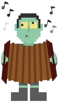

As an animated GIF, this polka-playing image is about 353Kb in size, but as an animated SVG it’s just 6Kb, less than 2% of the GIF’s size. That’s massive size (performance) savings with the SVG, while looking crisper doing it.
I drew the character in a graphics program and outputted it as an SVG. I used Affinity Designer but you could use Adobe Illustrator, Inkscape, Figma, or anything else that exports SVG.
Side Note: In my export, I made certain to check the “reduce transformations” box in order to make it easier to animate it. If you don’t reduce transformations, the elements can appear in all kinds of cockamamie contortions: scaled, translated and rotated. This is fine if the element is static, but if you want to move it in any way with transformations, you’ll have to figure out how editing the transformations will affect your element. It almost certainly won’t be straightforward and may not even be decipherable. With reduced transformations, you get an element in its natural state. You can then transform it in whatever way you need to.
After outputting, I created the CSS animation using @keyframes then added that to an SVG style element (which works just about exactly the same as an HTML style element).
See Complete SVG File
<svg xmlns="http://www.w3.org/2000/svg" xml:space="preserve" fill-rule="evenodd" stroke-linejoin="round" stroke-miterlimit="2" clip-rule="evenodd" viewBox="0 20 250 440">
  <style>
    /* Music Note Animation */
    .musicnote {
      animation: 4s ease-in-out calc(var(--multiplier) * 1s - 1s) notes forwards infinite;
      opacity: 0;
    }
    /* These custom properties allow for some variation in the timing of each note so that there animations overlap and seem more random while also allowing one set of keyframes to be used for all seven notes */
    #n1 { --multiplier: 1 }
    #n2 { --multiplier: 1.2 }
    #n3 { --multiplier: 1.4 }
    #n4 { --multiplier: 1.6 }
    #n5 { --multiplier: 1.8 }
    #n6 { --multiplier: 2 }
    #n7 { --multiplier: 2.2 }
    @keyframes notes {
      /* move the notes up 2em while also varying their opacity */
      0% {
        opacity: 0;
        transform: translateY(0);
      }
      30%, 80% {
        opacity: 1;
      }
      100% {
        opacity: 0;
        transform: translateY(-2em);
      }
    }
    #zright, #zleft {
      /* Sets the initial state for each hand and side of the accordion */
      --multiplier: -1;
      transform-origin: 0 0;
      transform: translateX(0) rotate(0);
      animation: 4s ease-in-out 0s play forwards infinite;
    }
    #zleft {
      /* allows the same keyframes to be used for both sides by reversing the translation and rotation */
      --multiplier: 1;
    }
    @keyframes play {
      0%, 100% {
        transform: translateX(0) rotate(0);
      }
      50% {
        transform: translate(calc(var(--multiplier) * 31px), calc(var(--multiplier) * -1px)) rotate(calc(var(--multiplier) * 2deg));
      }
    }
    /* Animates the squeeze and stretch of the accordion bellows */
    #accord {
      animation: 4s linear 0s squeeze forwards infinite;
      transform-origin: center center;
      transform: scaleX(1);
    }
    @keyframes squeeze {
      0%, 100% {
        transform: scaleX(1);
      }
      50% {
        transform: scaleX(0.8);
      }
    }
  </style>
<g id="zombie">
  <!-- The main zombie head and body, everything except the hands -->
  <path fill="#676767" fill-rule="nonzero" d="M62 207h121v47H62z" />
  <path fill="#91c1a3" fill-rule="nonzero" d="M99 190h46v26H99z" />
  <path fill="#3a3a3a" fill-rule="nonzero" d="M156 87h10v19H78V87h9v-9h69v9Z" />
  <path fill="#9cd3b3" fill-rule="nonzero"
    d="M155 105h9v18h19v29h-10v27h-9v9h-9v10h-18v9h-29v-9H90v-10H80v-9h-9v-27h-9v-29h18v-18h10v-9h65v9Z" />
  <path id="eyes" fill="#fbeb8e" fill-rule="nonzero" d="M127 114h31v28h-31zm-37 0h28v28H90z" />
  <path fill="#758b7c" fill-rule="nonzero" d="M108 170h11v9h-11z" />
  <path fill="#91c1a3" fill-rule="nonzero" d="M118 133h9v28h-9z" />
  <path fill="#444445" fill-rule="nonzero" d="M90 123h9v9h-9zm46-9h9v9h-9z" />
  <path fill="#3a3a3a" fill-rule="nonzero" d="M164 102h9v39h-9zm-93 0h9v39h-9z" />
  <path fill="#676767" fill-rule="nonzero" d="M118 393v57H46v-37h34v-58h38v38Z" />
  <path fill="#9cd3b3" fill-rule="nonzero" d="M80 384h38v10H80z" />
  <path fill="#676767" fill-rule="nonzero" d="M128 393v-38h38v58h34v37h-72v-57Z" />
  <path fill="#9cd3b3" fill-rule="nonzero" d="M128 384h38v10h-38z" />
</g>
  <g id="accord">
<!-- THe accordion bellows -->
    <path fill="#9e6330"
      d="m191 201-20 7-25 7-20 4-25-2-25-7-24-3-14-2-18 147 23 9 24 6 29 5 30 4 25-6 27-8 29-1 17-9-19-152-14 1Z" />
    <path fill="#774b24"
      d="m107 214-10-1-6 162 10 1 6-162Zm14 2h10v162h-10zm31-5-10 1 4 162 10-1-4-162Zm23-6h-10l7 162h10l-7-162Zm20-8-10 1 17 166 10-1-17-166ZM81 208l-10-1-10 162h10l10-161Zm-20-5-10-1-16 162 10 1 16-162Z" />
  </g>
<g id="notes">
  <!-- The seven musical notes -->
  <path id="n7" class="musicnote" fill="#2f2f2f" fill-rule="nonzero"
    d="m200 153 5-23 2 1 2 1v1h2l-1 1h2l4 1 1 1v1h2l-1 2h1v1l2 1h1l-1 2-1-1v1h-4l1-1h-2v-1h-4l-1 1-3-1v-1h-2l-4 19h-1v2h-1l-1 1-1 1-2-1v1h-3v-1l-2-1v-1h-1l1-1h-1v-1h6v-1h2v-1h3v-1h-5v1h-2v-1l-1 1v-1l-3 1h-1l1-2h1v-2h1v-1h1v-1l2 1 1-1h3l-1 1 3 1-1 1h1Z" />
  <path id="n6" class="musicnote" fill="#2f2f2f" fill-rule="nonzero"
    d="m16 78 3-23h2v1h3v1h1v1h6v1h1v2h2l-1 2h1v1h2v1h1v1h-3v1h-2v-1h-2v-1h-2v1l-2-1v1h-4v-1h-2l-2 19h-1l-1 2h-1v1h-1v1h-2v1l-3-1v-1H7v-1H6v-1H5v-1h2v-1h5v-1h1v-1h3v-1h-4v1H5h1l-1 1v-2h1v-2h1v-1h1v-1h2l1-1h3l-1 1 3 1-1 1h1Z" />
  <path id="n5" class="musicnote" fill="#2f2f2f" fill-rule="nonzero"
    d="m40 111 1-7h2l-1 13h-1v2h-1v1h-1v1h-2v1h-4l1-1h-2v-1l-1-1v-1h-1v-2h-1v-3h1v-2h1v-1h1l1-1h2v-1l3 1v1h2v1Zm3-13-1 6h-2l1-16h2v1h3v1h1v1h6v1h1v1h2v2h1v1h1v1h1v1h-1v1h-4l-1-1h-5v1l-3-1h-2Z" />
  <path id="n4" class="musicnote" fill="#2f2f2f" fill-rule="nonzero"
    d="M220 79h2l1 1 1-1v1h2l-1-1h6v1h2v2h1l1 1 1-1v1h1l1 1h-2l1 1h-2v1h-4v-1l-2 1-2 1v1h-6l2 7 1-1 2 13h-1l1 2-1 1v1h-1v1h-2v1l-3 1v-1h-2v-1h-1v-1h-1l-1-2-1 1v-3l1-1-1-2h1v-1h1v-1h2v-1l3-1v1h2v1l1-1-1-6h-2l-3-16 2-1 1 1Z" />
  <path id="n3" class="musicnote" fill="#2f2f2f" fill-rule="nonzero"
    d="M226 183v-7h2l-1 13h-1v2h-1v1h-1v1h-2v1h-3v-1l-2-1v-1h-1v-1h-1v-2h-1v-3h1v-2h2v-1h1v-1h2v-1l3 1v1h2v1h1Zm2-14-1 7h-2l1-16h2l3 1v1h1v1h2v-1l4 1v1h1v1h2v2h1v1h1v1h1v1h-2v1h-3l1-1h-2l-3-1v1h-5v-1h-2Z" />
  <path id="n2" class="musicnote" fill="#2f2f2f" fill-rule="nonzero"
    d="m23 164 2 13h-1v2l-1 1 1 1h-1v1h-2v1l-3 1v-1h-2l-1-1h-1v-1h-1v-2h-1l-1-3h1v-2h1v-1h1v-1l2-1v-1h3v1h2v1l1-1-1-6 2-1Zm-1-15 2-1 1 1h1v1h1v-1l5-1v1h1v1h2v2h1l1 1 1-1v1h1v1h-1v1h-1v1h-2v-1l-2 1v-1l-3 1h1l-2 1-4 1v-1h-2m-2-9h-2l3 17 2-1-3-16Z" />
  <path id="n1" class="musicnote" fill="#2f2f2f" fill-rule="nonzero"
    d="m188 72 3 13h-1v2h-1v2l-2 1v1h-3v-1l-2 1-1-1h-1v-1h-1v-2l-1 1-1-3 1-1v-2h1l-1-1h1v-1l2-1v-1h3v1l2-1 1 1-1-7h2Zm-2-16h3v1l1-1v1h2l4-1h1l1 1h1l1 2h1v1l1-1 1 1h1v1h-1v1h-1v1h-4l-1-1-2 1-2 1v1h-5l1 7h-2l-3-16h2Z" />
</g>
  <g id="zleft">
    <!-- The left hand and left side of the accordion -->
    <path fill="#676767" d="m11 255-5-1-2 17v19l10 22 9-49-12-8Z" />
    <path fill="#9cd3b3" fill-rule="nonzero" d="m15 257 4-16-9-2-4 16 9 2Z" />
    <path fill="#581610" d="m11 294 7-87h6v-5h6l1-5h6v-5l6 1-16 184h-6v-5l-5-1v-5l-6-1v-5l-5-1 6-65Z" />
    <path fill="#9cd3b3" fill-rule="nonzero" d="m24 283-1 9-19-2 2-35 20 2v8l8 1-1 18-9-1Z" />
    <path fill="#330d09" d="M17 249h7l-5 51h-7l5-51Z" />
    <path fill="#48120d" d="m16 256 7 1-3 36-7-1 3-36Z" />
    <path fill="#6b6108" d="M19 251h3l-1 3-2-1v-2Zm-4 44h3l-1 3h-2v-3Z" />
  </g>
  <g id="zright">
    <!-- The right hand and right side of the accordion -->
    <path fill="#676767" d="M237 253h3l4 18 2 19-11 25-11-51 13-11Z" />
    <path fill="#9cd3b3" fill-rule="nonzero" d="m231 258-6-15 8-3 6 15-8 3Z" />
    <path fill="#581610" d="m224 366-27-176 6-1 1 5h6l1 5 6-1v5l6-1 14 89 8 55-5 2v5l-6 1 1 5-6 1 1 5-6 1Z" />
    <path fill="#9cd3b3" fill-rule="nonzero" d="m221 266-2-8 20-3 5 35-20 2-1-8-9 1-2-17 9-2Z" />
    <path fill="#330d09" d="m228 249-7 1 8 51 7-1-8-51Z" />
    <path fill="#48120d" d="m229 256-7 2 6 36 7-1-6-37Z" />
    <path fill="#6b6108" d="m226 251-3 1 1 3 3-1-1-3Zm7 44-3 1 1 3 3-1-1-3Z" />
  </g>
</svg>
Code language: HTML, XML (xml)
Then, you save the SVG as a file and bring it into the webpage with an HTML img tag.
<img src="zombieaccordion.svg" alt="A zombie playing ear-bleeding notes on an accordion">Code language: HTML, XML (xml)Background Images
These animated SVGs don’t just work in the img element, they also work as a CSS background-image. So you can have a hundred little zombies playing the accordion in your background. That said, repeating the animation potentially infinitely takes a hit on page performance. For instance, during testing, when I had the zombie playing as a background image, another copy of the SVG in an img element struggled to animate.
Media Queries
Some media queries from within the SVG pierce the vale and work normally! Queries for width, height and even prefers-color-scheme worked just fine. But it’s a mixed bag. I couldn’t get print, pointer or, worst of all, prefers-reduced-motion to work. But those media queries that do work can give you even more flexibility in how you work with these animated SVGs.
Using @media (max-width: 300px), the animation below only plays when the img is 300 pixels wide or larger. To be clear, the max-width media query is based on the size of the img element, and not the size of the screen.
Plus media queries work even in background images! They can be a little trickier because, for instance, the width queries work on the size the image appears at, not the size of the container.
Gotchas
While most of this works the way any other CSS animation would, there are some limitations to how the CSS works in the SVG file shown in img vs. how it would work embedded in the HTML directly. As replaced content, the SVG is in a sort of sandbox and cannot access much outside the file.
- The animation has to run automatically. You can’t use hover effects or clicks to start the animation.
- Despite width and height media queries working within the SVG, viewport units do not work within the SVG.
- As mentioned above, the animation won’t recognize
prefers-reduced-motion, whether theprefers-reduced-motiondeclaration is within the SVG or in the larger site. While neither would an animated GIF recognize it, it unfortunately won’t give you that additional built-in functionality. On the plus side, any system you had that would prevent an animated GIF from playing should be easily modifiable to also apply to the SVG. - The SVG won’t run JavaScript from within the SVG. While a GIF wouldn’t run JavaScript either, I had hoped to get around
prefers-reduced-motionnot working by implementing it with JavaScript, but that too didn’t work. It’s probably a good thing it doesn’t, though, as that would be a massive security hole. - Modern CSS may or may not work. I was delighted to see custom properties and nested selectors working fine in my tests, but exactly what modern features are available and what may not work (like
prefers-reduced-motion) will require more testing.
This technique works in all versions of the latest browsers and should theoretically work as far back as style elements and CSS animations are supported in SVG.
Alright let’s get those hamsters… errr… zombies dancing!


So cool!