

Custom <select> menus are a thing now, especially because they can be progressively enhanced into. Una has some great examples.

I was recently at CSS Day and got to see Brecht De Ruyte do a whole talk on it. He’s also go a threefour-part series on it (starting here). My brain was full of CSS stuff while there, I had a weird hankering to work on a custom select that combined a bunch of it. I roped Brecht into collabing on my idea.
See, we were on the heals of the whole liquid glass thing from Apple and it seemed fun to make the selects kinda glassy with borders and blur. I also wanted to if animating the select in was possible (and maybe stagger them in?!). Plus, I was reminiscing about the original weird iOS select UI where it had a special UI that came up from the bottom. Is that maybe… better? for thumb-reach? So let’s try that.
The Base
I like Brecht’s snippet that sets the stage nicely:
select {
  appearance: none;
  @supports (appearance: base-select) {
    &,
    &::picker(select) {
      appearance: base-select;
    }
  }
}Code language: CSS (css)
That’s saying:
- We’re going to wipe out the base styling anyway. Even browsers that don’t support the entire suite of custom styles for selects support styling the basic element itself, just not the “picker” part.
- In browsers that support it, we need to set
appearance: base-select;to opt-in to the custom styleabtlity, and we need to do it both on the select itself and the picker, which uses this newfangled pseudo element.
Minor aside: it’s interesting that the appearance value is base-select for now. In the hopefully-not-too-distant future, we’ll be opt-in “resetting” not just selects but all the form elements with appearance: base. But I guess that isn’t far enough along and may have been a slightly dangerous breaking change scenario, so it’s isolated to base-select for now. So be it.
The Glassy Look
We’ve got the ability now to style the select directly and a good amount of lienency to style it however we want. Here, a blurry background is applied and the dropdown arrow is applied with a background SVG. (This is Brecht’s cool idea and implementation, as a reminder.)
select {
  display: flex;
  justify-content: space-between;
  min-width: 300px;
  align-items: center;
  color: white;
  padding-block: 10px;
  padding-inline: 10px 30px;
  border: 0;
  border-radius: 5px;
  cursor: pointer;
  font-weight: 700;
  backdrop-filter: blur(5px);
  background: oklch(0.4764 0.2094 259.13 / 0.3)
    url("data:image/svg+xml,%3Csvg xmlns='http://www.w3.org/2000/svg' fill='none' viewBox='0 0 24 24' stroke-width='1.5' stroke='%23FFF' class='size-6'%3E%3Cpath stroke-linecap='round' stroke-linejoin='round' d='m19.5 8.25-7.5 7.5-7.5-7.5' /%3E%3C/svg%3E%0A")
    right 10px center / 20px no-repeat;
}Code language: CSS (css)
Even in Firefox, which doesn’t support appearance: base-select, we’ve got the look we’re after:

We have no ability to style the picker in Firefox or Safari (yet!) but that’s totally fine. We just get the default experience:

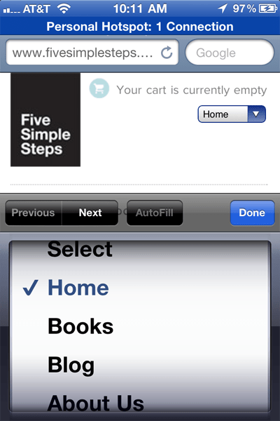
Our goal is to change up this experience on small screens, so it’s a little unfortunate this stuff isn’t in iOS yet (it is in Android!) but again, we just get the default experience which is fine:

The Picker Icon
We can start playing with, in a progressive enhancement friendly way, styling the custom “picker” now. Let’s do the icon first.
select {
  ...

  @supports (appearance: base-select) {
    background: oklch(0.4764 0.2094 259.13 / 0.3);

    &:focus,
    &:hover {
      background-color: oklch(0.4764 0.2094 259.13 / 0.6);
    }

    &::picker-icon {
      content: "";
      width: 20px;
      height: 20px;
      background-image: url("data:image/svg+xml,%3Csvg xmlns='http://www.w3.org/2000/svg' fill='none' viewBox='0 0 24 24' stroke-width='1.5' stroke='%23FFF' class='size-6'%3E%3Cpath stroke-linecap='round' stroke-linejoin='round' d='m19.5 8.25-7.5 7.5-7.5-7.5' /%3E%3C/svg%3E%0A");
      transition: rotate 0.2s ease-out;
    }

    &:open::picker-icon {
      rotate: 180deg;
    }
  }
}Code language: CSS (css)
When the browser supports it, we’ll rip off the SVG background we were using for the dropdown arrow and apply it as the ::picker-icon instead. That alone isn’t terribly useful, but now because we can target it individually, we can animate a rotation on it. That’s nice.
The Picker
Styling the part that opens up when you active a select we’re calling the “picker”, and this is the part that’s completely new to be able to style. You get your hands on it with the somewhat unusual select::picker(select) selector. You have to put select in the pseudo function thing — it’s the only valid value. For now? Maybe it’s because in the future they’ll want to use ::picker for date inputs or the like? Not sure but whatever.
select {
  ...

  @supports (appearance: base-select) {
    ...

    &::picker(select) {

    }
  }
}Code language: CSS (css)
We don’t really need much styling of the picker itself. That is, we want to remove the base styling by making the background transparent. The option elements themselves will have the look.
This is where we’re going to do some interesting positioning, though. The way the ::picker positions itself next to the select is: anchor positioning! Of course it is, might as well use the layout primitives baked into the browser. It does feel weird/interesting to see at work though, as we need to be aware of it to change it. We’re going to wait for small screens, then attach the picker to the bottom of the screen.
select {
  ...

  @supports (appearance: base-select) {
    ...

    &::picker(select) {
      background: transparent;

      @media (width < 400px) {
        position-anchor: --html;
        bottom: 0;
        width: 100%;
      }
    }

    option {
      backdrop-filter: blur(12px);
    }
  }
}Code language: CSS (css)
Again the theory there is small screens are often phones and we’re moving the picker down to make it more thumb-reachable. It’s an assumption. Maybe we should be thinking in terms of @media (pointer: coarse) or something, but I’ll leave that to you, we’re just playing.
Animating
I’d rate this stuff as decently complicated to animate. Here’s some reasons:
- The Shadow Root is at play here, making using DevTools to poke around in there while you’re working is a little extra cumbersome.
- The
::pickeris a displaynonetoblockchange when it becomes visible, which means to animate it you need to remembertransition-behavior: allow-discreteand how all that works. - We’re also going to need
@starting-styleto get incoming animations, which can be repetitive. Plus some bonus staggering. - We’ve got an
:openstate to mix in,@mediaqueries to mix in, a:checkedstate for the options with a::checkmark, and other pseudos.
All together, it just feels like a lot. It’s a lot of different nested state spread out. Even trying to organize it as nicely as possible, it’s hard to keep straight. The nesting is handy, but you can’t nest quite everything. Like the :open state is on the select, so you can’t style the ::picker and then the open state within it, which would be handy for @starting-style, because you really need to write select:open::picker(select) not select::picker(select):open It’s fine it’s just a little bah humbug.
Lemme just put the basics for the stagged in/out animations for the option elements here for a taste:
select {
  ...

  @supports (appearance: base-select) {
    ...

    option {
      ...

      transition-property: opacity, scale;
      transition-duration: 0.2s;
      transition-delay: calc((sibling-count() - sibling-index()) * 100ms);
      scale: 0.25;
      opacity: 0;
    }

    &:open {
      option {
        scale: 1;
        opacity: 1;
        transition-delay: calc(sibling-index() * 100ms);

        @starting-style {
          scale: 0.25;
          opacity: 0;
        }
      }
    }
  }
}Code language: CSS (css)
See above it was necessary to repeat the option selector. Not a huge deal, but you usually expect to avoid that with nesting. Plus the @starting-style thing can feel repetitive, but that’s offering the possibility of different in-and-out styling so it’s ultimately a good thing.
The staggered / scale / fade-in thing feels nice to me, and particularly nice when they skoosh up from the bottom anchored position.
Demo
There’s a bunch more CSS tucked in there to make it all happen, so you might as well have the whole thing here:
