
Transcript from the "Balance: Symmetry" Lesson
[00:00:00]
>> Sarah Drasner: So one of the things that we talk a lot about in these things is balance and symmetry. So having something be harmonious by being mirrored on both sides. And don't worry, we're gonna talk about asymmetry too, this is not the only way of working. So you can see things that use balance and symmetry in art.
[00:00:20] This is a Damien Hurst painting. We can see it in architecture. I'm gonna use architecture references a few times because I think it's one of the older, showing that this has kind of gone through human history. But also the investment, right? To build something like this and decide we're gonna go for symmetry, and have people work on it for 1,000 years, yeah, that's an investment in symmetry, [LAUGH] right?
[00:00:47] You feel like you spend a lot of time on a weekend project. Woo, this is a lot of investment in symmetry. There are some really great Dribble shots that show things like balance and symmetry. But even in these, we're starting to get a sense of where asymmetry might start to leak in.
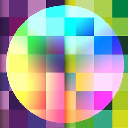
[00:01:06] So if you look at the one on the left by Ben Kocinski, you start to have the way that maybe instead of having all the colors line up exactly or breaking that symmetry to keep the rhythm in your eye moving around. So it's not super flat. And the really nice thing about symmetry is that when you do break that, your eye goes right there.
[00:01:31] So if you want to draw people's attention, and you're employing something like symmetry, you can break it. And then have people call people's attention to a certain area. So in this design, everything kind of lines up, everything kind of lines up in a Monument Valley. But then they really wanna bring you over to that tunnel, so they kind of break that idea of symmetry and then that's where your eye goes.
[00:01:59] So websites can often get these kind of ideas of symmetry over and over and over again. You can also see where they break the symmetry in order to call your attention to a call to action. So anything that's bright that shows a different piece of that composition is another way of drawing attention.
[00:02:21] But here's where symmetry kind of falls flat. Things can get really symmetrical and it does look very ordered, but it also starts to kinda look a little boring, right? I like these sites, they're okay. These are demo sites by the way, I'm not picking on any businesses. They're okay, but I wouldn't go tell someone about them later, right?
[00:02:42] I wouldn't be like, my God, you have to see this site [LAUGH] that I saw the other day. It looks just like all the other sites I saw the other day [LAUGH]. So there are really great ways of presenting yourself professionally using symmetry, but sometimes it starts to look really kinda basic.
[00:03:04] So breaking out of that.