Temporal
Tailwind CSS 4+

4 hours, 27 minutes
CC

Course Description
Learn Tailwind CSS's utility-first approach to build out entire web designs without any custom CSS! Compose any design directly in markup and implement advanced responsive layouts with flexbox, grid, and container queries. Build accessible, interactive components and add UI polish with dark mode, animations, & transitions.
Prerequisite: Modern CSS Fundamentals or equivalent HTML/CSS experience.
Preview
Course Details
Published: August 4, 2025
Rating
Learning Paths
Learn Straight from the Experts Who Shape the Modern Web
Your Path to Senior Developer and Beyond
- 250+ In-depth courses
- 24 Learning Paths
- Industry Leading Experts
- Live Interactive Workshops
Table of Contents
Introduction
Section Duration: 16 minutes
 Steve introduces the course by explaining Tailwind as a utility-first CSS framework that uses single-purpose classes for styling. He highlights its benefits, such as faster prototyping and fewer cascade issues, while noting concerns like class bloat.
 Steve explains that you don't need to know every detail of Tailwind—just the basics. It scans code files for full class names, allowing customization of colors, spacing, and fonts, but warns against complex setups that can break things.
Best Practices & Anti-Patterns
Section Duration: 10 minutes
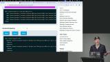
 Steve explains Tailwind CSS layers including, theme for variables, base for HTML element styles, and components for elements like buttons. He covers the @layer and @utility, notes that layer order affects output, but Tailwind handles it internally, making code order flexible and helping with tooling like IntelliSense.
 Steve explains how the theme layer lets you use CSS variables to customize colors. He also highlights Tailwind responsive utilities like `md` and `lg`, which reduce the need for media queries and help keep code concise and flexible.
 Steve highlights common Tailwind patterns and anti-patterns, stressing the use of utility classes over custom ones for maintainability. He recommends setting theme variables and avoiding arbitrary values to keep code cohesive and reduce the need for extra CSS.
Element Styling, Borders, & Spacing
Section Duration: 44 minutes
 Steve demonstrates setting up the course website called Tailwind Skatepark and provides various tools and resources for Tailwind CSS development, including a Tailwind CSS IntelliSense plugin for VS Code. He emphasizes the importance of using these tools for efficient development.
 Steve demonstrates how the IntelliSense plugin reveals CSS for Tailwind classes and walks through styling a button with padding, rounding, and shadows.
 Steve instructs students to create and style either the secondary button or the danger button. He then demonstrates how to style the secondary button, covering background color, padding, borders, shadows, and hover effects. Steve also discusses how borders influence button size and introduces outlines to enhance interactive elements.
 Steve explains the differences between using borders, outlines, and rings in web design. He highlights that outlines are preferred to prevent layout shifts caused by borders, and mentions that rings, while still available, are more of a hack using box shadows. Steve emphasizes that unless specific design needs require it, outlines are generally the best choice for interactive elements.
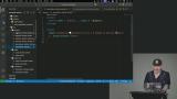 Steve instructs students to create a card layout using borders, background colors, and typography. He also walks through a possible solution styling with CSS properties like padding, rounded corners, and font styles.
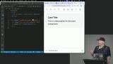 Steve discusses layout techniques like margin-based layouts, Flexbox, and Grid for arranging components. He also shows how to use Tailwind utilities like space Y, space X, and divide Y for spacing in a card list.
Form Styling
Section Duration: 31 minutes
 Steve shows how to style an input field with Tailwind CSS utility classes for states like required, invalid, and disabled. He highlights Tailwind’s flexibility in customization and explains using Flexbox for layout spacing and CSS for element styling.
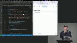 Steve explains how to style input fields in different states like required, valid, invalid, focused, and autofill. He clarifies user-valid vs. user-invalid and shows how Tailwind pseudo-classes make styling easy without complex JavaScript.
 Steve covers CSS focus states like focus, focus-visible, and focus-within, explaining their differences and use cases for better accessibility. He also shows how Tailwind variants make it easy to apply these styles effectively.
 Steve demonstrates how to use CSS focus-within with checkboxes to style elements based on interaction, focusing on dynamic styling.
Utility-First Styling
Section Duration: 1 hour, 7 minutes
 Steve demonstrates utilizing Tailwind's "group" and "peer" classes to style elements based on parent or sibling interactions, enabling interactive effects with just CSS.
 Steve explains how the CSS "has" selector lets a parent style itself based on its children, enabling dynamic interactions without JavaScript. Used with selectors like "group" and "peer," it allows for powerful, minimal-code styling.
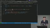 Steve demonstrates how to use the combination of "group" and "has" to style elements based on their attributes without using JavaScript. By utilizing pseudo-elements and CSS selectors, he shows how to add a visual indicator, like a red dot, to a label when an input field is required.
 Steve instructs students to refactor a checkbox container to change its background when checked, then walks through the solution. He also suggests challenges like revealing more questions based on selection and emphasizes breaking UI into smaller, testable parts.
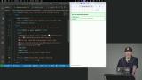 Steve builds a file tree with checkboxes to show selected files in folders. He styles child checkboxes based on parent selection using classes like "peer" and "pointer-events-none," and notes accessibility challenges and when JavaScript might be needed.
 Steve demonstrates how to style form elements for accessibility using classes like sr-only for screen reader visibility, outline for focus states, and has for input validation styling.
Flexbox & Grid Layouts
Section Duration: 1 hour, 4 minutes
 Steve explains how Flexbox works with Tailwind CSS to simplify layouts. He demonstrates properties like direction, alignment, and responsive design using utility classes, highlighting Tailwind’s efficiency in frameworks like React or Angular.
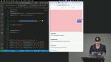 Steve instructs students to transform a basic navigation bar using flexbox properties. He then demonstrates a solution using flex, justify, align, and other utility classes for the navigation layout.
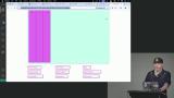 Steve compares Flexbox and CSS Grid, focusing on Grid’s two-dimensional layouts. He shows how to set up grids, adjust rows and columns, and build responsive designs with Tailwind. He also covers spanning, reordering, and more complex layouts.
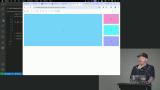 Steve instructs students to create a traditional blog layout with a header, sidebar, and footer, adapting it to a responsive one-column layout for mobile. Steve then demonstrates adjusting column sizes, heights, and grid settings to create a dynamic layout transition from mobile to desktop views.
 Steve introduces container queries in responsive design, showing how they let elements adapt to their container’s size instead of the viewport. This offers flexible layouts without needing multiple component versions or extra class adjustments.
Tailwind Extras
Section Duration: 23 minutes
 Steve explains two ways to implement dark mode in Tailwind CSS: using a media query based on the user's color scheme or by adding a class like .dark to elements. He demonstrates how to adjust styles for dark mode by adding dark variants to Tailwind classes.
 Steve introduces tools like tailwind-merge, Class Variance Authority, and Tailwind UI to improve design systems, boost efficiency, and maintain consistency in development.
 Steve discusses adding transitions and animations by mapping utility classes to CSS properties like transition colors. Tailwind also supports advanced features like custom durations and starting styles.
Wrapping Up
Section Duration: 9 minutes
 Steve wraps up the course by discussing a student's question regarding the upgrading from Tailwind 4 to a hypothetical Tailwind 5. He also shares resources for developers to choose color schemes and discusses setting up Tailwind in a monorepo.
Awesome course if you want to enhance your tailwind skills to next level.

Mubbasher Ashraf