Snook.ca Web Development, Inc.
Scalable Modular Architecture for CSS (SMACSS)

5 hours, 51 minutes
Course Description
CSS architecture expert Jonathan Snook shares his experience building large sites with large teams to make your CSS more maintainable using his Scalable Modular Architecture for CSS (SMACSS) methodology. Learn categorization and naming convention—things that might seem simple at first but can actually be quite difficult. Then go deeper with a number of concepts and examples that help demonstrate when to create class rules instead of element rules, how to limit depth of applicability, and how to manage visual states.
This course and others like it are available as part of our Frontend Masters video subscription.
Preview
Table of Contents
Categorization
Section Duration: 1 hour, 9 minutes
 Jonathan Snook begins the SMACSS course with a brief overview of his work history. He started as a freelance developer, moved over to Yahoo, and is now working at Shopify.
 While Jonathan was at Yahoo, he started thinking about how you make CSS scalable. This lead to him to writing SMACSS. SMACSS provides categorization and naming conventions to CSS. This allows it to decouple from HTML and is better for state-based designs.
 Categorization begins with base styles. Base styles typically include your element selectors and CSS resets or normalize styles. On top of the base styles are the layout styles which include the major containing elements like header, sidebar and main content.
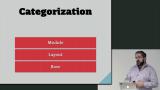 Modules contain content and are the majority of the site. They are an interface each user will have to learn. Modules may require variations like size or color which leads to the creation of module variations.
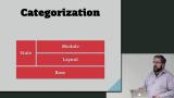 State styles are like a module variation except indicate a dependency to JavaScript. They describe the look of a module as it’s affected by JavaScript. Theme styles are useful with sites that require on-the-fly changes to the look and feel.
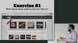 In this exercise, create various layout styles for the 5by5.tv website.
 Jonathan walks through the solution to exercise 1.
Naming Convention
Section Duration: 1 hour, 30 minutes
 Naming base styles is easy because you use the tag name like html, body, or h1. Layout styles begin with the prefix “layout-“. What follows the prefix is the location. Jonathan recommends using class selectors over ID selectors because of the specificity issues that can arise.
 Module names do not contain a prefix. Module variations, however, are prefixed with the module name. For example, .btn may be the module name and .btn-large would be a variation name. Style names of module child element should not include the module name so they can be rescued elsewhere.
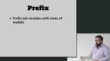 Naming states involves adding an “is-“ prefix to the state name like. If the state is specific to a module, then it would be prefixed with the module name. For example, the .btn module may have an active state. That state would be named .btn-is-active.
 Theme names use the prefix “theme-“. This allows developers to use the theme classnames throughout the HTML and easily switch out the theme on-the-fly.
 While answering a question from the audience, Jonathan describes why he likes to hand-code all his CSS and not borrow from any third-party libraries.
 Prefixing CSS classes with a version name can make migration easier. Version prefixes are easily identifiable and are an indication that a module has been updated. Prefixing is also helpful for packaging or isolating CSS and reducing conflicts.
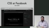 Jonathan shows a few resources about how other companies like Facebook deal with CSS issues like minification and conflict resolution. He also answers a few follow-up questions on versioning.
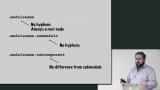 Jonathan reviews all the naming conventions he has covered up to this point. He also shares a few alternative naming conventions like Block-Element-Modifier.
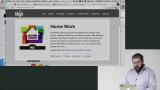 In this exercise, Jonathan asks the audience to identify FIVE possible modules and the classnames they should be given.
Decoupling CSS from HTML
Section Duration: 1 hour, 28 minutes
 Jonathan spends a few minutes talking about base element. In some cases, elements (like a button) should not be considered base and created as a module instead. This allows for more flexibility in design.
 When looking at your CSS, it’s important to consider how much HTML is impacted by the rules you write. Too much nesting in CSS rules make maintaining HTML code more difficult.
 Writing single class selectors can be an effective way to break the link between HTML and CSS. These single class selectors would allow you to use different HTML elements in similar locations without needing to change your CSS.
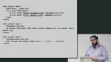 While answering an audience question, Jonathan shows a brief example of the Owl Selector and discusses his opinions on when it should be used and when it should be avoided. He also talks briefly about the Single Responsibility Theory.
 In this exercise, create a SMACSS-based navigation system for the Engadget website.
 Jonathan walks through the solution to exercise 3.
State-based Design
Section Duration: 1 hour, 43 minutes
 In SMACSS, states can be represented as classes, pseudo-classes, attribute selectors, and media queries. Jonathan begins his discussion on states by talking about the first three state representations.
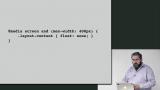 Media query states alter the existing CSS at a specific resolution. The should be included with the modules they affect to make maintenance easier. Jonathan talks about a media query strategies and also answers a few audience questions on Modernizr.
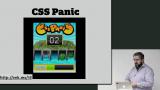 Jonathan shares a game called CSS Panic with the audience. This game is made completely CSS and doesn’t include any JavaScript. It’s a creative example of a state-based approach with CSS.
 Preprocessors provide variables, nesting, and functions to CSS. They also compile all files into a single deliverable. Jonathan demonstrates how preprocessors work and talks about the advantages and pitfalls as they relate to SMACSS.
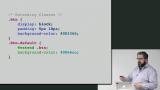 Preprocessors allow for CSS classes to be based on another class. Extending CSS classes is nice for code reuse but can lead to side effects. The generated CSS can become quite large and difficult to work with.
 Prototyping allows developers to build and test individual components and keeps front-end development independent of engineering. Jonathan shares a few prototyping experiences from his work at Yahoo and Shopify.
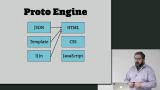 Jonathan walks through Proto Engine which is the prototyping tool he used at Yahoo. He talks about how Mustache was used for tempting within the prototypes. Jonathan also demonstrates a few other third-party prototyping tools.
 Creating a style guide is useful for documenting front-end development requirements. Automating the generation of a style guide helps reduce redundancy or errors. Jonathan talks about a few tools like Hologram which can help make building and maintaining style guides easier.
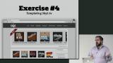 In this exercise, create a template for the feature pane and content pane on the 5by5.tv website.
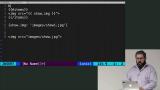 Jonathan walks through the solution for exercise 4.
 Jonathan wraps up the course by covering some best practices with project structure and measuring performance. He gives a number of resources and addresses a couple last audience questions.
Learn Straight from the Experts Who Shape the Modern Web
- 250+In-depth Courses
- Industry Leading Experts
- 24Learning Paths
- Live Interactive Workshops