Isovera
Responsive Web Typography v2

4 hours, 24 minutes
CC

Course Description
In this course, Jason Pamental demonstrates type fundamentals to create better user experiences on mobile and desktop. Following along with the course, you'll learn how to implement web fonts and create a modern, scalable typographic system. Plus, Jason gives an overview of variable fonts, a type file standard developed to reduce page weight with smaller font sizes and achieve more flexible designs than ever before!
Preview
Course Details
Published: August 15, 2018
Rating
Learn Straight from the Experts Who Shape the Modern Web
Your Path to Senior Developer and Beyond
- 250+ In-depth courses
- 24 Learning Paths
- Industry Leading Experts
- Live Interactive Workshops
Table of Contents
Introduction
Section Duration: 1 hour, 53 minutes
 Jason Pamental begins the course by going over the schedule for the day and explains the profession of being a web typographer.
 Jason reviews the course agenda, including the basics of typography, an introduction to responsive typography, variable fonts, and others. Then Jason also talks about how performance, progressivity, proportion, and polish helps aid the user experience.
 Jason answers a question figuring out how to know where the breakpoint is when resizing the viewport to best impact user experience regarding web typography.
 Jason defines typography, how it affects a user's experience, and why typography in the context of the web.
 After introducing serif and sans-serif typefaces, Jason provides a methodology on how to make two typefaces work together.
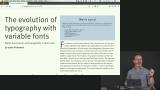
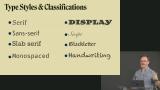 After introducing several different type styles and their applications, Jason gives several examples of how the typeface can evoke a time or a particular place. Then Jason demonstrates several typefaces that work well together visually and discusses methods on how to choose pairings.
 Jason dives deeper into the four tenants of responsive typography: performance, progressive, proportion, and polish. Then Jason focuses on performance, as well as why a designer needs to understand how fonts affect the experience of the user.
 Jason defines progressive enhancement as a conscious decision to ensure that the webpage works at a baseline level even if other aspects of the user experience fail.
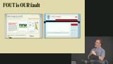 Jason reviews the Flash of Unstyled Text (FOUT) effect and how to mitigate the impact on users.
 Jason reviews the significance of maintaining proportion in design when transitioning from desktop to mobile.
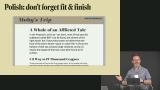 After describing the finer points of typography, which include kerning and ligatures, Jason reviews plug-ins that may be used to enhance the user experience.
 Jason elaborates on several text treatment techniques and the importance of using real content in your project to ensure resiliency.
 Jason demonstrates the benefits of planning the loading of fonts using tools such as Typekit and other services.
 Jason introduces variable fonts, which is when a single font file acts can be used to display multiple fonts, and how they are helpful in responsive web design.
 Jason discusses browsers support variable font and how to work around browsers without variable font support.
 Jason introduces the W3C Font 3 & 4 specifications and instructs on how to be involved in the extensive Github discussion on how the web should work.
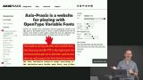 Jason introduces several resources for diving deeper into variable fonts, including Axis-Praxis, which allows the user to play with the axes of variation, and open type features available in variable fonts. Then Jason reviews websites dedicated to education on variable fonts and addresses the state of open source variable fonts.
Implementing
Section Duration: 1 hour, 11 minutes
 Jason talks about the first rule of web design and methods to achieve the desired aesthetic without blocking page rendering. Jason introduces code that implements these concepts, and also instructs on how to approach @font-face support versus JavaScript support by tuning for the loading process rather than assuming either is present.
 After reviewing areas where designs can fail when sizing headings of content on mobile, Jason discusses an example on how to best optimize for the smaller screen while preserving meaning using proportion and typography.
 Jason inspects the code for a web page that still functions, even when the CSS fails. Then Jason examines use cases for @font-face, including demonstrating how to keep a browser from synthesizing an italic or bold typeface.
 Jason utilizes Chrome Developer Tools to show what slow loading time looks like to a user when implementing variable fonts. A question is answered regarding whether it's better to utilize a service's CSS embedding, or the JavaScript embedding feature in font hosting sites.
 Jason demonstrates how to quickly import a typeface for a third-party hosting service, Google Fonts, into a website.
 After showing how to set responsive font sizes for different breakpoints with media queries, Jason explains how a variant font was imported, the font-variation-settings, and the rules for defining custom axes.
 Jason introduces an approach that uses custom CSS variables to linearly scale font sizes that adjust based on a minimum and maximum size.
 Jason reviews examples of a page design that experiments with a single variable font's different font weights and as well as font size scaling.
 Jason introduces using CSS variables as a method to streamline potential changes in web design, such as including color inversion on a typeface.
 Using CSS @supports at-rule, Jason shows a technique for displaying a dynamic message to a browser does not support variable fonts.
 Jason answers a question from a student about Tim Brown's scalable equation based on the maximum and minimum font sizes on the page.
Future of Web Typography
Section Duration: 48 minutes
 While variable fonts are implemented in some browsers, Jason discusses additional font features that are still missing or are partially implemented.
 Jason reviews optical sizing in typefaces through the context of print designs of the past.
 After introducing additional OpenType features, including ligatures, swashes, and kerning, Jason discusses how to create a graceful fallback and overall great experience in the typography should a type feature fail to display.
 Since the paragraph is a central element of web page design for a media or text-based site, Jason reviews how specific CSS selectors can be used to layer different design treatments onto a paragraph.
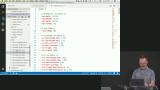 Jason demonstrates polishing techniques to improve a page's web typography such as setting the first line of text in a paragraph, styling an initial cap, adding ligatures and kerning, and more.
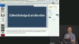 Jason reviews how the state of editorial design and art direction on the web might be better with different approaches by taking better advantage of web typography.
 Jason showcases a design example that uses principles from magazines to create magazine-quality aesthetic to a website by using layering and scaling to create a sustainable editorial effect.
Wrapping Up
Section Duration: 30 minutes
 Jason reviews several websites that allow for experimenting with the capabilities and benefits of variable fonts.
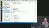 While reviewing an outdoor magazine design layout, Jason demonstrates the use of the CSS grid, variable fonts, shapes editor, and grid developer tools.
 Jason wraps up the course by reviewing Codepen demos that showcase variable font capabilities.