Professional CSS: Build a Website from Scratch

Kevin Powell

Kevin Powell

Kevin Powell Media Inc.
9 hours, 4 minutes CC
Professional CSS: Build a Website from Scratch

Course Description

Write CSS like a Pro! Build a responsive website from scratch using the latest CSS features like custom properties, nesting, CSS grid layouts, and helpful utility classes. Add polish with animations, custom view transitions, advanced bento-style layouts, and filtering. Deploy your site with a GitHub Actions workflow to Netlify and show off your professional CSS skills!

This course and others like it are available as part of our Frontend Masters video subscription.

Preview
Close

Course Details

Published: January 8, 2025

Learn Straight from the Experts Who Shape the Modern Web

Your Path to Senior Developer and Beyond
  • 200+ In-depth courses
  • 18 Learning Paths
  • Industry Leading Experts
  • Live Interactive Workshops
Get Unlimited Access Now

Table of Contents

Introduction

Section Duration: 5 minutes
  • Introduction
    Kevin Powell introduces the course and explains what material will be covered. He discusses the project of building a website from scratch using HTML, CSS, and JavaScript, and mentions that the website will be responsive and referencing a Figma design file.

The Structure

Section Duration: 12 minutes

Base CSS Styles

Section Duration: 1 hour, 1 minute
  • CSS Methodology
    Kevin discusses the importance of having a plan in place before writing CSS for a project. He encourages students to analyze the design and consider factors such as widths, background colors, border radiuses, and text styles before deciding on the best approach for writing CSS.
  • CSS Reset
    Kevin explains the concept of CSS resets and why they are used. He walks through a specific CSS reset code and explains each line of code and its purpose. Kevin also discusses some CSS properties and techniques such as box-sizing, text-size-adjust, margin, padding, list styling, body min block size, default line height, and text-wrap: balance and text-wrap: pretty.
  • CSS Layers
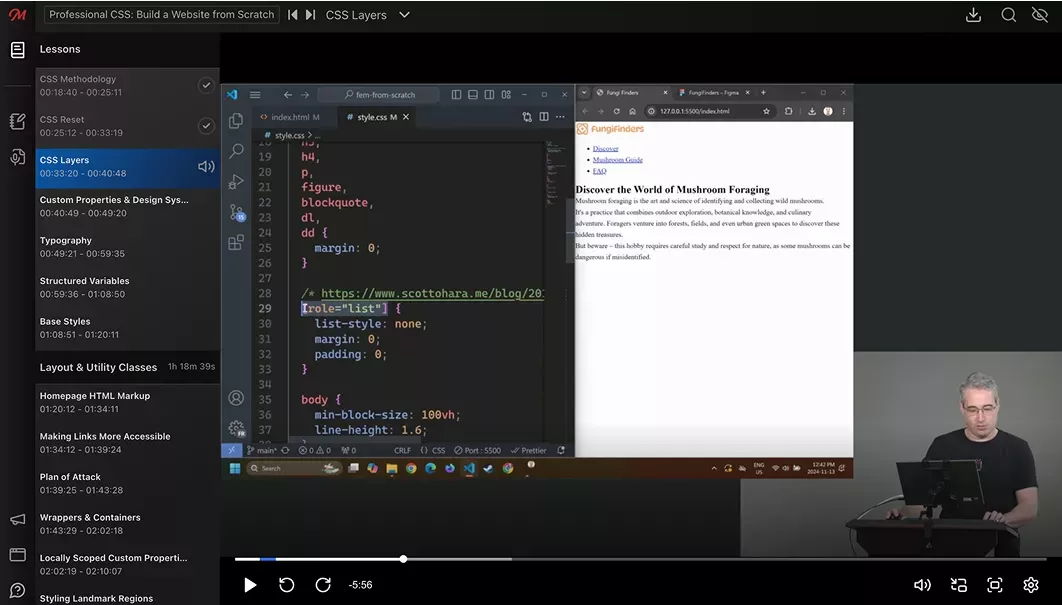
    Kevin introduces layers in CSS and explains how they can be used for project maintenance. He demonstrates how to create a layer and discusses the benefits of using layers to avoid specificity issues. Kevin also mentions the option to define the order of layers at the top of the CSS file and briefly mentions sub-layers.
  • Custom Properties & Design Systems
    Kevin discusses creating a design system and using custom properties in CSS to define reusable styles. He focuses on the colors section of a design system and explains how to name and organize colors using a consistent numbering system.
  • Typography
    Kevin demonstrates how to link Google fonts and use them in CSS, as well as how to define font families and font sizes using custom properties. Kevin also explains the importance of using relative units like REM for font sizes to ensure accessibility and responsiveness. He provides examples and shows how to use media queries to adjust font sizes for different screen sizes.
  • Structured Variables
    Kevin discusses the process of structuring custom properties in a design system. He also demonstrates how to set up custom properties for text colors, background colors, font sizes, and border radiuses.
  • Base Styles
    Kevin walks through setting up base styles in CSS by setting the font family, line height, font size, and color for the HTML selector. He also explains the concept of separating styles from semantic elements and suggests using more generic selectors instead of relying solely on heading levels.

Layout & Utility Classes

Section Duration: 1 hour, 18 minutes
  • Homepage HTML Markup
    Kevin guides the students through writing the HTML structure for a webpage. He also discusses the importance of meaningful alt text for images and provides examples of how to write alt text.
  • Making Links More Accessible
    Kevin discusses the importance of creating meaningful links in web design. He demonstrates how to use the visually hidden class to hide additional descriptive text within the link, making it more informative for screen reader users while still maintaining a visually appealing design.
  • Plan of Attack
    Kevin discusses the approach to styling the webpage using CSS. He encourages students to think about reusable elements and how to create different layouts using columns. Kevin also briefly introduces source control using Git and demonstrates how to commit and sync changes to GitHub.
  • Wrappers & Containers
    Kevin discusses layouts and introduces the idea of creating a wrapper or container to limit the width of content. He demonstrates how to add a wrapper and explores different approaches for creating modifiers for the wrapper. He also discusses the advantages and disadvantages of each approach and provides examples of how to implement them.
  • Locally Scoped Custom Properties
    Kevin discusses the benefits of using custom properties and locally scoped custom properties. He demonstrates how to use locally scoped custom properties with wrappers to make it easier for developers to understand and modify code. Kevin also mentions the use of data attributes and modifier classes and encourages experimentation to find what works best for each project.
  • Styling Landmark Regions
    Kevin discusses the use of landmark regions in web development, such as nav, header, footer, article, section, aside, etc. He emphasizes the importance of giving these landmark regions a class for better reusability and styling.
  • Utility Classes
    Kevin discusses the concept of utility classes and how they can be used to create reusable styles in a project. He explores examples of utility classes such as font sizes, background colors, and text alignments.
  • Styling Image Border Radius
    Kevin demonstrates how to use a generic selector to add a border radius to all images in the codebase, instead of adding a utility class to each individual image.

Responsive Web Design

Section Duration: 44 minutes
  • Intrinsic Layout
    Kevin discusses the benefits of using a mobile-first approach and provides examples of when it may be more appropriate to use a desktop-first approach. He also demonstrates how to create responsive navigation using flexbox and the flex-wrap property, allowing the navigation items to wrap to a new line on smaller screens.
  • Creating Columns
    Kevin discusses different approaches to creating columns in a web design. He explore using flexbox and grid to create equal columns and discuss the advantages and disadvantages of each approach. Kevin also demonstrates how to use custom properties and data attributes to create reusable and customizable column layouts.
  • Creating Flow & Spacing
    Kevin discusses the concept of flow in CSS and how to reintroduce spacing between elements. He also explores different methods, such as using the pros class or the lobotomized owl selector.

Component Styling

Section Duration: 32 minutes
  • Styling the Hero
    Kevin demonstrates how to combine utility classes with custom classes to style a hero section, including centering the text, changing the font size, adding a background image, and styling a span within the heading. He also explains his approach to class naming and provides tips for improving the visual appearance of the text.
  • Styling the Cards
    Kevin discusses different approaches to styling cards in a web design project. He explore options such as using utility classes, creating separate classes for different card types, or using custom properties with fallback values. Kevin demonstrates how to implement these approaches and explains the benefits and considerations of each one.
  • Styling Buttons
    Kevin walks through styling the buttons by adding CSS properties such as display, padding, background color, font family, font weight, text decoration, and cursor. He also adjusts the border radius, font size, and adds hover and focus styles to enhance the button's appearance and functionality.
  • Styling the Footer
    Kevin demonstrates the different elements and classes used to style the website's footer according to the provided Figma design.

GitHub Workflow with Netlify

Section Duration: 1 hour, 7 minutes
  • Deploying to Netlify
    Kevin demonstrates how to push code changes to GitHub and then connect the GitHub repository to Netlify. He also walks through how to access the deployed site and mentions the option to set up a custom domain and enable HTTPS.
  • Adding a Hamburger Menu
    Kevin walks through updating the navigation by adding a hamburger menu button and providing accessibility context through alt text, hidden text, and aria attributes. He emphasizes the importance of considering accessibility when adding interactive elements to a website.
  • Styling the Mobile Navigation
    Kevin demonstrates how to style the navigation for mobile screens. He utilizes media queries for smaller screen sizes and to make changes to the flex-direction, background color, font size, and spacing of the navigation elements.
  • Navigation Events with JavaScript
    Kevin demonstrates how to use JavaScript to open and close a mobile navigation menu. He uses the `document.querySelector` method to select the button and adds an event listener to the button that listens for a click event and toggles the `area-expanded` attribute of the button.
  • Merging Git Branch
    Kevin explains how to commit changes to a branch in VS Code, merge the branch with the main branch, and create a pull request on GitHub. He also demonstrates how to preview the changes on Netlify before merging them into the main branch. Finally, they show how to delete the branch from GitHub and sync the changes back to the local machine.
  • Skip Navigation for Accessibility
    Kevin demonstrates how to create a "skip to main content" link in a website's navigation. This link allows users who navigate using a keyboard to bypass the navigation and jump directly to the main content of the page. Kevin explains the importance of this feature for accessibility and provides step-by-step instructions on how to implement it using HTML and CSS.

Creating a Second Page

Section Duration: 2 hours, 1 minute
  • Creating & Marking Up a New Page
    Kevin demonstrates creating a second page for a website using vanilla HTML. He introduces concepts such as view transitions, progressive enhancements, theming, and customizations.
  • HTML Markup for Cards
    Kevin walks through creating a grid of cards using HTML and CSS. He also demonstrates how to add data attributes to the cards for future JavaScript functionality.
  • Responsive Cards Columns with Grid
    Kevin demonstrates how to create a grid layout with equal columns using the autofit function, which automatically adjusts the number of columns based on the available space. He also shows how to use the minmax function to set a minimum column size and prevent overflow.
  • Styling the Card & Tags List
    Kevin styles the tags by adding a class to the list items and applying CSS properties such as padding, background color, font size, font family, and border radius. He also demonstrates how to use custom properties to style the card titles and adjust the gap between the cards.
  • Grid vs. Flexbox Layouts
    Kevin discusses a common issue with grid layouts where tags or elements within the grid are sometimes the wrong size. He demonstrates how to use the grid and flexbox inspectors in the browser's DevTools to visualize and debug the layout. Kevin also suggests using flexbox instead of grid in certain cases and explains how to use margin auto to position elements within a flexbox container.
  • Styling Select Elements
    Kevin discusses that styling select elements is currently difficult because the options inside the select cannot be styled. However, he provides some basic styling options for select elements, such as changing the background color, padding, border, and text color.
  • Creating a Bento Grid
    Kevin explains the concept of bento layouts and why CSS grid is a better choice than Flexbox for this type of layout. Kevin walks through the process of creating the grid layout, assigning grid areas, and positioning the cards within the grid. He also discusses setting breakpoints for different screen sizes and making adjustments to the layout.
  • Fine-Tuning the Bento Grid
    Kevin demonstrates how to adjust the positioning and sizing of elements using CSS Grid and Flexbox. He also shows how to use the nth-child selector to change the order of elements within a layout.
  • Adding Navigation Items
    Kevin demonstrates how to use anchor tags and IDs to create smooth scrolling to specific sections of the page. Kevin also discusses the importance of considering users with vestibular issues and provides a solution for reducing motion for those users.

Filtering Cards

Section Duration: 51 minutes
  • Tips for Scaling a Codebase
    Kevin discusses the need to plan for new additions to the project and to create reusable components whenever possible. Kevin talks about the use of custom properties and cascade layers to help with organization. He also mentions the importance of refactoring and making changes to improve code structure.
  • Layers, Sublayers, & Scope
    Kevin explain that layers can be defined at the beginning and used throughout the project and that sublayers can be used within the scope of a parent layer for better organization. He suggest using CSS scope for scoping styles to specific selectors if needed.
  • Filtering with CSS
    Kevin provides an example of filtering a mushroom guide based on the selected season using CSS selectors. However, they caution against using complex CSS-only solutions for filtering and recommend using JavaScript instead, as it is more efficient and flexible for DOM manipulation. He also mentions the potential accessibility concerns with CSS-only solutions for user interaction.
  • Filtering with JavaScript
    Kevin demonstrates how to create a filtering functionality for a set of cards using JavaScript. Kevin also discusses the event listener for the change event and shows how to retrieve the selected value from the event target.
  • Updating Filters
    Kevin demonstrates how to create a function called "updateFilter" that takes an event as a parameter. The function retrieves the filter type from the event target and updates the current filters accordingly. Kevin also shows how to use this function as a callback for multiple event listeners, allowing the filters to be updated dynamically based on user input.
  • Filtering Cards
    Kevin explains how to filter cards based on selected tags. He demonstrates how to access the tag values of each card using querySelector and data attributes. He also shows how to compare the tag values with the selected filters and hide or show the cards accordingly.
  • Handling Zero Matches
    Kevin discusses the issue of cards stretching too large when using the auto-fit property in CSS grid. Kevin also demonstrates how to handle the situation when there are no matches for a filter by adding a message indicating that there are no results.
  • Fallback for No JavaScript
    Kevin discusses the importance of considering users who do not have JavaScript enabled when building a website. He suggests adding a simple fallback solution by hiding certain elements and using JavaScript to enable them when it is available.

Animation Techniques

Section Duration: 52 minutes
  • Progressive Enhancement
    Kevin explains that progressive enhancement involves adding features to a website that enhance the user experience. Kevin also mentions that different users may have different experiences on a website, and that progressive enhancement allows for a more tailored experience based on the capabilities of the user's browser or device.
  • Page View Transitions
    Kevin introduces same-document view transitions and cross-document view transitions. He also demonstrates how to add a cross-document view transition by using a CSS at-rule and shows an example of a crossfade transition between pages.
  • Document View Transitions
    Kevin demonstrates how to add a fading animation to filter cards based on user input. He explains how to enhance the animation by adding movement to the elements when they are filtered. Kevin also discusses the importance of using unique view transition names for each element and provides some tips for optimizing view transitions.
  • Animating display: none
    Kevin demonstrates how to animate elements that have a "display: none" property using CSS. He explains the limitations of animating the display property and introduces the new "transition-behavior: allow-discrete" property that allows for animating the display property. He also shows how to use the "@starting-style" property to define the starting styles for the animation.
  • Clipping Animation Overflow
    Kevin introduces the "overflow: clip" property, which clips the overflowing content without affecting the scroll behavior. He also mentions the bonus feature of "overflow: clip margin" which allows for a little extra space to be added while still clipping the content.
  • Animating List Items
    Kevin demonstrates how to add animations and transitions to a navigation menu. He shows how to use CSS transitions and transforms to animate the list items of the navigation menu when it is opened. He also explains how to use custom properties and nth-child selectors to create a staggered animation effect.
  • Resize Observer
    Kevin addresses the issue of the menu transitioning away when resizing the browser and provides a solution using a ResizeObserver and JavaScript.
  • Scroll-Driven Animations
    Kevin demonstrates how to create a scroll-driven fade-out animation for the hero section and how to control when the animation starts using the "animation-range" property. He also cautions against overusing animations and recommends being mindful of user experience and accessibility considerations.

Theming and Customization

Section Duration: 13 minutes
  • Light & Dark Mode
    Kevin demonstrates how to create a light theme by adding new custom properties and adjusting existing ones. Kevin explains how to handle situations where certain elements, such as text on a dark background, need to remain unchanged in the light theme. He suggests using the light-dark technique to specify different colors for different themes.
  • Updating the Published Site
    Kevin demonstrates how to sync the changes to the website, which triggers Netlify to build the site with the updated changes.

Wrapping Up

Section Duration: 1 minute
  • Wrapping Up
    Kevin congratulates students on completing the course and encourages them to take the time to review and practice the material covered. He also highlights the benefits of using CSS for creating maintainable and enjoyable web designs.

Learn Straight from the Experts Who Shape the Modern Web

  • In-depth Courses
  • Industry Leading Experts
  • Learning Paths
  • Live Interactive Workshops
Get Unlimited Access Now