Temporal
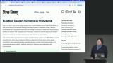
Design Systems with Storybook, v2

4 hours, 9 minutes
CC
Course Description
Build scalable component libraries and design systems with Storybook. Create reusable UI components with composable styles and variants using Tailwind CSS. Use MDX for documentation, set up interaction testing, and add data fetching to create a robust dev environment for your component library.
Preview
Course Details
Published: June 5, 2024
Rating
Learning Paths
Topics
Learn Straight from the Experts Who Shape the Modern Web
Your Path to Senior Developer and Beyond
- 250+ In-depth courses
- 24 Learning Paths
- Industry Leading Experts
- Live Interactive Workshops
Table of Contents
Introduction
Section Duration: 5 minutes
 Steve begins the course with a brief tour of the course website and resources. This course will cover everything from basic setup to advanced features like atomic design, accessibility, visual regression testing, responsive design, and dark mode implementation.
Getting Started
Section Duration: 1 hour, 14 minutes
 Steve demonstrates Storybook Sandboxes, which help test some functionality within Storybook without the overhead of installing Storybook into your current project or spinning up a new project. Storybook is a framework-agnostic tool and can work with any framework.
 Steve creates primary and secondary stories for the button component. The meta object in a story creates the page for the stories and can provide default data passed to the props. Individual properties can be overridden in each story.
 Steve shares some examples of design systems from Microsoft, IBM, Twilio, and GitHub. Using a prop to set the variant of a component is a common practice. This prop might be "variant," "kind," or "appearance." The name used in your design system should be consistent across all components.
 Steve creates variants for the button component. A ButtonProps type is defined to create a union type for the available variant values. The Storybook variants are updated to use the correct variant class.
 Steve adds the Destructive variant to the story. Then the clsx library is used to compose class names for components. The base button styles, variant, and any additional custom classes are passed to the clsx method, and a string with those class names is returned.
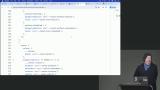
 Steve demonstrates how to add a select control to Storybook so the available variants can be selected from a dropdown. The variant type is also adjusted so they are optional.
 Steve adds a variant for size. The sizes are small, medium, and large. The CSS classes are added and variant defaults are coded in the story.
Styling
Section Duration: 1 hour, 3 minutes
 Steve demonstrates how to import third-party styles and scripts into the story. Tailwind CSS is imported into an index.css in the project. The CSS file is then imported into the preview Storybook component.
 Steve configures dark theme support for Tailwind CSS. Storybook decorators are introduced and used to add a theme switcher to the preview interface. The theme switcher modifies the configured data attribute to switch themes.
 Steve uses overrides to force dark mode in a story. URL query parameters can also be used to configure the preview for stories. The defaultViewport parameter sets the preview size, making previewing stories on mobile viewport widths easy.
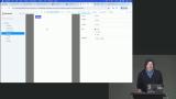 Steve discusses several considerations for deciding on a naming conversion for colors within them. The variables2CSS Figma plugin, which generates color variables for different formats, is demonstrated.
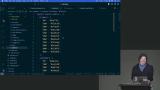 Steve customizes the colors and fonts in the Tailwind CSS theme. The custom colors overwrite the existing Tailwind colors to prevent colors outside the design system from being used. Since the default monospace font is still needed, the fonts are extended, and only the sans font is overwritten.
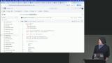 Steve shares examples from a real-world design system highlighting the number of styles and variants used in a button component. The Class Variance Authority package is introduced and compared to CLSX. The primary difference is the ability to add type safety for styles in UI components.
 Steve uses the Class Variance Authority library to add type-safety to the variant styles that can be applied to the button component. This abstracts the CSS styles within the button component and centralizes them in a single variant TypeScript file.
Components Documentation & Styling
Section Duration: 39 minutes
 Steve creates an MDX file to write markdown-based documentation for a component story. The MDX files support JavaScript, which allows the component and other Storybook Blocks to be imported and displayed on the documentation page. The ColorPalette and ColorItem blocks are also demonstrated in this lesson.
 Steve demonstrates how to organize stories into subgroups. Blocks can also be customized so the intent and use-cases of variants are better described.
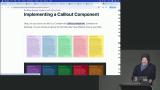 Students are instructed to implement a Callout component and create a Story to document the style and variants.
 Steven continues the solution to the Implementing a Callout Component exercise by creating the story for the callout component. The code used in the solution can be found at the link below.
Testing and Interactions
Section Duration: 46 minutes
 Steve uses the play function to simulate user interaction. Tests can be added to stories to ensure the UI responds appropriately to different interaction scenarios.
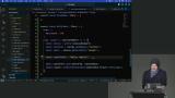 Steve adds additional tests to the story to validate attribute values and the existence of specific styles on the UI component. Styles can be validated either by class or individual style rules. Students are then instructed to add a test for a disabled Text Area.
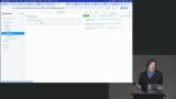 Steve demonstrates variant variations can be imported to create a union type and add type safety to the component styles.
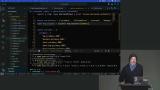 Steve demonstrates how to set up a test runner for Storybook tests. Playwright is the tool that executes the tests. The test runner can be added to a CI/CD pipeline to automate UI testing.
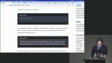 Steve walks through the capabilities of Chromatic, a visual testing & review tool that scans every possible UI state across browsers to catch visual and functional bugs. It can be used within Figma or as part of a CI/CD pipeline. Visual changes are detected and displayed in the Figma UI. The UI changes can be approved or rejected.
 Steve highlights the accessibility testing features within Figma that are enabled by installing the addon-a11y package. Violations will be listed, and the issues can be visually highlighted in each story.
APIs, Context, and External Dependencies
Section Duration: 14 minutes
 Steve explains that decorators allow you to wrap a component in your story with another component.
 Steve demonstrates how loaders offer a way to asynchronously load data or perform actions before a story is rendered. This can be useful when fetching mock data from an API, performing setup tasks, or dynamically manipulating props or globals based on external factors before the story is displayed.
Wrapping Up
Section Duration: 4 minutes
 Steve wraps up the course by sharing some advice on why adding a Storybook to help document a design system at any stage can benefit the long term.
🎓 Just Completed: Design Systems with Storybook, v2 Course!
Learned some new tricks to improve how I use Storybook in projects.

Juan Terneus
juan-terneus
I loved the course, I recently started documenting components for a project using Storybook and the course was incredibly handy.
When Steve showed how to include a color palette in Storybook, my mind just exploded 🤯

Pako
pakman198
Just finished "Design Systems with Storybook, v2" by Steve Kinney on Frontend Masters!
This course was a great journey into building scalable and maintainable design systems with Storybook. Excited to apply these new insights to my projects!

Ahmed Alwahed
ahmedabdalwahed