AnnieCannons
Practical CSS Layouts

8 hours, 58 minutes
CC
Course Description
Starting with the basics of CSS and HTML, you'll progress through creating responsive designs for mobile, tablet, and desktop layouts. You'll learn to code complex layouts with CSS Grid and Flexbox and tackle real-world exercises like styling buttons, audio players, hamburger menus, and lists. You'll explore concepts like rem and em units, custom fonts, responsive images, and the picture element. By the end of the course, you'll have built three variations of a website, each increasing in complexity!
This course and others like it are available as part of our Frontend Masters video subscription.
Preview
CloseLearn Straight from the Experts Who Shape the Modern Web
Your Path to Senior Developer and Beyond
- 200+ In-depth courses
- 18 Learning Paths
- Industry Leading Experts
- Live Interactive Workshops
Table of Contents
Introduction
Section Duration: 8 minutes
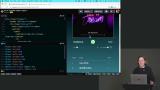
 Jen Kramer begins the course by sharing the course website and giving a brief tour of the design that will be built. Three variations of a website will be created, growing in complexity throughout the course. A demo of CodePen is also provided in this lesson.
Easy Design
Section Duration: 2 hours, 21 minutes
 Jen begins building a style guide page as part of the easy design. CSS custom properties are used to manage colors used in the design. Boxes displaying each color are tiled across the top of the page.
 Jen briefly explains the difference between rem and em units. The rem unit is relative to the root font size of the document, while ems are relative to their container.
 Jen creates a type scale that makes a series of proportional font sizes for things like heading, body, and copyright text. The benefit of using CSS custom properties is the base size can be adjusted, and the other sizes will scale automatically.
 Jen completes the base styles by adding the Poppins custom font from Google Fonts and adding styles to enable responsive image sizing. The final CodePen code can be found at the link below.
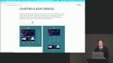 Jen codes the HTML markup for the easy design. Starting with HTML allows the page's structure to be built without worrying about how the content will look stylistically. Once the structure is in place, styles can be added.
 Jen begins adding CSS for the easy design. The styles take a mobile-first approach, styling elements for the smallest screens. Adding borders to elements can be a helpful tool when debugging CSS layouts.
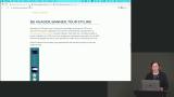 Jen styles the tour dates by wrapping the lines of text in span elements and applying classes. Span elements help style inline text because they are only used as wrappers and don't add semantics to the page.
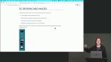 Jen adds CSS styles to the reviews and images. Once a width is applied to the star images, they can be centered with the text-align property since images are inline elements.
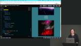 Jen spends a few minutes explaining how margins collapse vertically between block-level elements. Margin collapse can create confusion because the vertical margin between two elements will be less than the sum of their bottom and top margin values. A CodePen demo is created to illustrate this behavior.
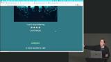 Jen completes the styling for the mobile design by adding CSS to the footer. The completed code for the mobile version of the easy design can be found at the CodePen link below.
 Jen begins styling the table layout for the easy design. The design differences between mobile and tablet layouts are discussed. A media query is introduced, which allows additional styling rules to be included at a specified viewport width.
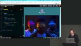 Jen explains that images can often get scaled larger than their intended size in responsive layouts. The picture element solves this issue by allowing developers to provide alternate images for different screen sizes.
 Jen completes the styling for the easy design tablet layout. The tour dates and reviews are arranged in rows and columns with CSS Grid. The code for the tablet design can be found in the CodePen link below.
 Jen codes the easy design's desktop layout. The grid-area property positions the tour dates in the right column, and header spacing is adjusted. The code for the desktop design can be found in the CodePen link below.
Medium Design: Tour Page & Tracklist
Section Duration: 1 hour, 9 minutes
 Jen begins styling the medium design's tour page. A background gradient is added, and text styles are updated. The beginning CodePen for the medium design can be found in chapter four of the course website.
 Students are instructed to style the buttons to match the design spec. Magenta is the text and border color. A border radius should be applied to round the corners.
 Jen addresses the Sold Out button styling. A visual indicator of the button's disabled state is applied. Hover effects are disabled.
 Jen styles the date and club tour text. The :has pseudo class is introduced and used to style paragraph text that has the class of club.
 Students are instructed to add layout styling to the tour date buttons and the footer. The solution can be found in the CodePen link below.
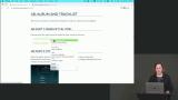 Students are instructed to use an HTML table to markup the tracklist, and a combination of h1 and h2 elements can be used to mark up the album information.
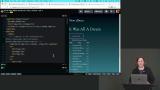 Jen walks through the solution to the Album & Tracklist exercise. The solution can be found in the HTML sections of the CodePen link below.
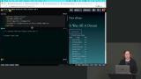 Jen styles the album information. A border is applied, and the font is adjusted. The final styles are in the @album layer of the CodePen link below.
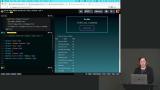 Jen styles the tracklist. The default table border is removed, and the :last-child pseudo element helps style the runtime of each track. The final solution can be found in the CodePen link below.
Medium Design: Reviews & Images
Section Duration: 40 minutes
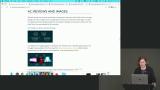 Jen codes the mobile design for the reviews and images sections of the website. Images are hidden, and the reviews are centered on the page in a two-column grid. The final code can be found at the CodePen link below.
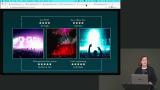 Jen begins styling the tablet layout for the reviews and images. The images are displayed, and the elements are arranged in a six-column grid.
 Students are instructed to correctly lay out the reviews and images across the grid rows and columns. The solution can be found in the CodePen link below.
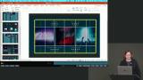 Jen styles the desktop layout for the reviews and images. Rather than using CSS Grid or Flexbox, the items can be stacked with a block layout because their order in the HTML matches where they should appear. Relative positioning is also reviewed in this lesson. The final code can be found in the CodePen link below.
Medium Design: Audio Player & Hamburger Menu
Section Duration: 1 hour, 40 minutes
 Jen introduces an audio player and discusses skinning it to match the design. An important part of the styling process is changing the player's look without breaking the functionality. Removing or renaming elements in the HTML can lead to JavaScript errors, so any element unnecessary in the design should be hidden with CSS.
 Jen examines the HTML markup and adds DIV elements to wrap the controls which need to be moved or styled together. These wrappers do not affect the functionality but allow the controls to be easily styled with CSS. The final code is in the HTML section of the CodePen linked below.
 Jen strips out some CSS styles copied from the example audio player and begins styling the player to match the current design. CSS Grid-based elements are nested to facilitate more complex layouts for the player controls.
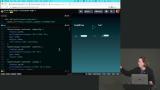 Jen continues styling the audio player by adding CSS for the play and mute buttons. Styling SVG graphics is also covered in this lesson.
 Jen styles the two range sliders, which control the play and volume levels. The default background is removed by using the transparent color value. The final code can be found at the CodePen link below.
 Jen finishes styling the audio player by adding an album image. The width of the image is constrained with CSS. The final code for the audio player can be found at the CodePen link below.
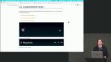 Students are instructed to style the menu to match the mockup in section 4E of the course website. The logo should replace the header text, and the colors should be applied. Use the CodePen link below as a starter for the exercise.
 Students are instructed to add the Magenta Lime image to the header next to the header text and apply the correct font. The solution can be found in the CodePen link below.
 Students are instructed to copy over the base styles and remove and duplicate styles. The header should be styled to match the course website's desktop layout design in section 4E. The final code can be found in the CodePen link below.
 Jen finishes styling the menu by applying tablet and mobile layout styles. A popup menu displays the menu items when the hamburger menu is clicked. The final code can be found at the CodePen link below.
Medium Design: Final Site Assembly
Section Duration: 22 minutes
 Students are instructed to assemble the individual components of the web page to create the mobile and tablet layouts. The final code can be found at the CodePen link below.
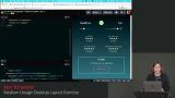 Students are instructed to create a desktop layout matching the mockup in Chapter 4 of the course website. The final solution for the medium design can be found at the CodePen link below.
Difficult Design: Small Elements
Section Duration: 1 hour, 2 minutes
 Students are instructed to style the "Photos from the Road" and "Magenta Lime Official Site" buttons. The CodePen linked below can be used as a starting point for this exercise.
 Jen walks through the solution to the Small Elements exercise. The solution can be found at the CodePen link below.
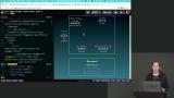 Students are instructed to style the reviews section of the page. The lightning bolts should be added, and the media query styles should be updated to match the mobile, tablet, and desktop layouts.
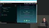 Students are instructed to style the album boxes. The "New Tour" box should have a background image, and the size should adjust as the screen gets wider. The final code can be found at the CodePen link below.
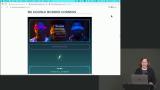 Jen adds double borders to the four corners of the album boxes. The additional borders are added by styling the ::before and ::after pseudo-elements. The final code can be found at the CodePen link below.
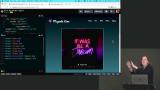 Students are instructed to adjust the navigation media queries so the menu links stay hidden until there is enough room for them to display on the same line as the logo. The final solution can be found at the CodePen link below.
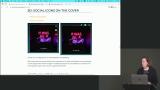 Jen adds social icons and overlays them on the album cover. The icons are positioned vertically in the upper right corner and become horizontal at larger screen sizes. The final code can be found at the CodePen link below.
Difficult Design: Advanced Styles
Section Duration: 1 hour, 27 minutes
 Jen adds a button to toggle the visibility of the tracklist and removes the tracklist column headings. The styles are adjusted to make the spacing more even.
 Jen adds JavaScript code which adds an event handler to the tracklist button. The event handler will find anything with the "hidden" class and replace it with a "showing" class. The final code can be found at the CodePen link below.
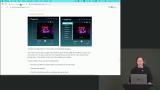 Jen modifies the tracklist design at the tablet and desktop breakpoints so it is positioned to the left of the album. The tracklist button will still toggle the visibility of the tracks.
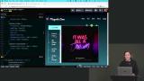 Jen finishes styling the tracklist in the tablet and desktop layouts. The width is adjusted to support the full width of the tracks. CSS transitions are added to animate the change in size and position of the button. The final code can be found at the CodePen link below.
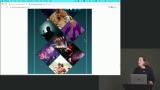 Jen begins styling the diamond images for the mobile layout. The mobile design has the images stacked vertically with a small amount of rotation applied.
 Jen finishes the styling for the diamond images. The clip-path property is used to create the diamond shape. Flexbox is combined with a complex margin-top calculation to create a unique layout. The final code can be found at the CodePen link below.
 Students are instructed to assemble all the elements of the difficult design. The final code can be found at the CodePen link below.
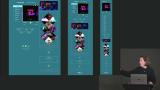 Jen creates the desktop breakpoints for the difficult design. Styling is applied to create two columns, moving the tracklist, audio player, and reviews into the first column and the rest of the content into the second column. The code for the final site design can be found at the CodePen link below.
Wrapping Up
Section Duration: 5 minutes
 Jen wraps up the course by reviewing the evolution of the Magenta Lime website. Links to all the designs and additional resources can be found on the course website.
Learn Straight from the Experts Who Shape the Modern Web
- In-depth Courses
- Industry Leading Experts
- Learning Paths
- Live Interactive Workshops