Instructional Designer
Ultimate CSS Grid & Layout Techniques, v3

6 hours, 21 minutes
CC
Course Description
CSS Grid is the most important tool in a modern web developer's toolkit for laying out web pages. With its two-dimensional structure, precise positioning, and overlapping elements, you’ll learn to achieve complex layouts with minimal code. You'll also explore advanced techniques like container queries for adaptive components and subgrids for nested layouts. Through hands-on CodePen exercises, you'll apply these techniques to real-world projects!
Prerequisite: CSS Fundamentals or equivalent knowledge.
Preview
Course Details
Published: May 8, 2024
Rating
Learning Paths
Learn Straight from the Experts Who Shape the Modern Web
Your Path to Senior Developer and Beyond
- 300+ In-depth courses
- 24 Learning Paths
- Industry Leading Experts
- Live Interactive Workshops
Table of Contents
Introduction
Section Duration: 10 minutes
 Jen Kramer begins the course by sharing a history of page layout from the early days when there was little CSS support through today when there is full support for CSS Grid and advanced layout features like container queries and subgrid. The course website is provided. Exercises will be coded in CodePen. Grid and Flexbox are compared.
Grid Basics
Section Duration: 32 minutes
 Jen explains that CSS Grid is best for layouts that span across rows and columns and sibling elements that need to overlap or cover each other. The properties available for styling depend on whether the styles are applied to a parent or child element.
 Jen creates a CSS class to display the figure elements in a grid layout. The `display: grid` style is applied, and the `grid-template-columns` property creates the desired number of columns.
 Jen demonstrates how to use the Chrome Developer Tools to inspect grid-based layouts. Row and column indicators appear and gaps between the rows and columns are shaded.
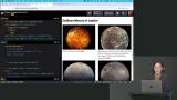 Students are instructed to make each figure element as a grid item and use the grid layout properties to have the caption appear to the right of the image. After the exercise, the layout is refined by centering captions vertically and creating a more complex two-column layout. The final code can be found at the CodePen link below.
Grid Span & Area
Section Duration: 18 minutes
 Students are instructed to create the image layout displayed on the chapter 3 page of the course website. The links to the beginning and ending CodePen links are in the Chapter 3 page below.
 Jen introduces the span and repeat syntax. The span value specifies the number of rows or columns an element should stretch across. The repeat function eliminates the need to repeat row or column values.
 Students are instructed to refactor the styles from column and row numbers to using spans. The beginning and ending CodePen links are in the Chapter 4 page below.
 Jen introduces grid areas, which allow names to be assigned to parts of a grid layout. Individual elements can be assigned to the grid areas by name rather than specifying the row and column numbers.
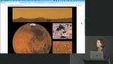
 Students are instructed to rewrite the grid system used on the Martian collage and use grid template areas instead. The beginning and ending CodePen links can be found in the Chapter 5 page below.
Responsive Design & Media Queries
Section Duration: 1 hour, 6 minutes
 Jen discusses two different approaches to website planning: Mobile-first and Desktop-first. Both methods can apply responsive web design techniques, but the best approach depends on the development process. Mobile-first excels when content planning is the primary task.
 Jen codes a max-width media query to adjust the layout for screen sizes of 700 pixels or less. By placing the media query at the end of the stylesheet, any rules activated by the query will override the existing classes and styles. The grid layout is changed to a single column in the media query, and the image spans are adjusted accordingly.
 Students are instructed to fork the moon collage CodePens and write desktop-first layouts using media queries. As an additional challenge, the styles can be refactored to a mobile-first approach. Links to the CodePen exercises and a solution can be found on the Chapter 6 page of the course website.
 Jen presents a responsive design project that requires laying out cards that display information about planets and moons. The layout will begin with a mobile-first approach and add media queries at 500, 700, and 900 pixels.
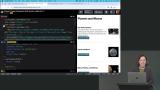 Jen styles the featured card in the layout. A "featured" CSS class is created to style the first card. The image in the featured card spans the entire width of the card, and the paragraph is hidden.
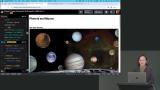 Jen continues styling the card layout by adding a media query for screens larger than 500 pixels. The cards below the featured card will be displayed in two columns. The headline, image, and button will also be displayed in one column.
 Students are instructed to add a media query to create three columns of cards when the screen is larger than 700 pixels.
 Students are instructed to add a media query to create the desktop layout of the page for screens larger than 900 pixels. The layout of the cards is also adjusted so the image is displayed to the right of the headline and button. The ending CodePen can be found at the bottom of the Chapter 7 page.
Overlapping Cells & Subgrid
Section Duration: 1 hour, 2 minutes
 Jen uses an overlapping row technique to make a figure's caption overlap the bottom part of an image. When elements overlap in a grid row or column, the element appearing later in the HTML will be on top. The layout is tested, and an additional media query is added to adjust the caption size.
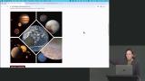 Jen uses the overlapping row & column technique to layout five planet images. The fifth image of the Earth overlaps the four other images and is rotated to look like a diamond. The final solution can be found at the CodePen link below.
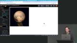 Students are instructed to use a CSS Grid layout to overlap two images. A CSS animation should be added to fade the second image in and out.
 Jen spends a few minutes discussing issues that arise with vertical margins and CSS Grid. Vertical margins typically collapse so elements do not have double margin spacing. However, with grid gap, this may not be the case. A solution is demonstrated and alternatives are also discussed.
 Jen demonstrates how minmax, auto-fit, and auto-fill functions can constrain columns and create more controlled layouts. The minmax function specifies a minimum and maximum width. The auto-fit and auto-fill functions control will either fill a grid row with as many columns as possible or fit columns across the entire width of the container.
 Jen introduces CSS subgrid, which provides more granular control of elements nested within a grid layout. So when these nested elements become grid containers, their children can track across the rows and columns of the parent grid container.
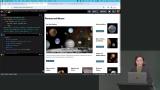 Jen applies the subgrid to the planet and moon page layout to help align the headlines, buttons and images for all the nested card elements.
Moons of Saturn Exercise
Section Duration: 48 minutes
 Students are instructed to begin styling the Moons of Saturn page layout. The full exercise will use a mobile-first approach, starting with the smallest screen sizes. The beginning CodePen, layout guides, and additional resources can be found on the Chapter 10 page of the course website below.
 Students are instructed to add a media query for screens larger than 500 pixels and adjust the layout to match the design in the Chapter 10 instructions. Subgrid should be used to align the headings, paragraphs, and buttons.
 Students are instructed to add media queries for screens between 750 and 999 pixels and adjust the layout to match the design in the Chapter 10 instructions. The second and third cards have their paragraph text removed and are displayed to the right of the featured card. Additional media queries can be added to adjust the design if needed.
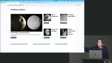 Students are instructed to finish the Moons of Saturn layout by adding styles for screens larger than 1000 pixels. The final solution can be found in the Chapter 10 page linked below.
Flexbox
Section Duration: 59 minutes
 Jen explains Flexbox is excellent for a series of containers not the same size or elements that aren't displayed in an evenly sized grid. Flexbox helps achieve equal spacing between elements in layouts where the size of the elements is not consistent.
 Jen demonstrates the flex-direction and flex-wrap properties. The values for flex-direction can be row, row-reverse, column, or column-reverse. The flex-flow property can be used as a shortcut for the flex-direction and flex-wrap properties.
 Jen demonstrates the justify-content & align-items Flexbox properties. The justify-content property will align elements across the main axis. The align-items property aligns elements across the opposite (cross) axis. Properties like order and flex-basis which can be applied to child elements are also demonstrated in this lesson.
 Jen styles a navbar using Flexbox. The navbar is justified to the end (right) of the Flexbox container and margin-right is used on the logo to separate it from the navigation items. A max-width media query is added to adjust the layout on smaller screen sizes.
 Jen adds additional styles for larger screen sizes for the navbar. The logo is displayed on larger screens after the first two navigation items and before the last two. The Flexbox order property is used to reorder the elements.
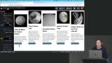 Students are instructed to add a media query for screens larger than 600 pixels and apply a Flexbox layout to the cards. Cards should wrap, forming two rows with three on top and two on the bottom. The beginning CodePen for this exercise is linked below.
 Students are instructed to add a media query for screens larger than 900 pixels and adjust the Flexbox layout to display cards across a single row. The cards should be justified at the bottom so the buttons line up. The final solution can be found at the CodePen link below.
Responsive Images
Section Duration: 28 minutes
 Jen discusses the history and challenges of images in responsive designs. There are many strategies for optimizing for pixel densities, display dimensions, or art direction. The picture element is also introduced in this lesson.
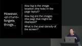 Jen talks through the srcset and sizes attributes and compares them with the responsive image techniques of the picture element. While the picture element was good for content purposes, srcset and sizes allow the correct image to be loaded based on technical parameters like viewport size, pixel density, aspect ratio, etc.
 Jen uses the picture element to control the visibility of four different images. The srcset attribute specifies the URL of the image. The media attribute contains a media query with the conditions for when the images should be displayed.
Container Queries
Section Duration: 53 minutes
 Jen introduces CSS container queries and explains there are two different options available. Container size queries consider the width of the container, not the viewport width like a media query.
 Jen uses container queries to style various layouts for the cards. The layouts are applied when a card container has a minimum width of 200, 250, 500, and 550 pixels. An important thing to remember about container queries is that while they are based on the size of the container, only child elements of the container can be styled.
 Students are instructed to use container queries to style the first card in the design to match the reference design. A "featured" class should be added to the container and image, headline, paragraph,and button should remain in a single column.
 Jen completes the card page layout by adding media queries to display cards in columns on larger screen sizes. The existing container queries control the layout of the elements in the individual cards based on their container's size.
 Jen demonstrates container style queries by creating a dark mode toggle. When a checkbox is toggled, JavaScript code updates a CSS custom property. A container style query styles the page based on the value of the custom property.
Wrapping Up
Section Duration:
 Jen wraps up the course by summarizing the topics covered. You can find more CSS courses in our CSS Learning Path.
Earn a Completion Certificate
After completing this course, you'll receive a certificate of completion that serves as proof of your achievement, showcasing your expertise, and commitment to professional development. You can easily share this certificate on your LinkedIn profile to highlight your new skills and demonstrate continuous learning to potential employers and professional connections.

What They're Saying
This course is awesome! I would definitely recommend it to someone who wants to dive deep into grid as well as some other modern CSS features.

Muhamed Husic
This is the best course for understanding layouts. It's so well taught, in-depth, and covers the latest features.

Jaivardhan Mishra
Thank you for this course Jen Kramer and Master.dev! Just finished laying out a website post taking this course with CSS Grid, and it took about half the time it would have taken with my previous method using flexbox.

Jamaal Amedee