YouTube
Modern CSS Fundamentals

10 hours, 40 minutes
CC
Course Description
Build the CSS foundation you need to tackle any frontend project! Learn the essentials of typography, responsive grid layouts, and form styling. Add polish with shadows, animations, and decorative pseudo-elements. By the end, you'll have the confidence to dive into your next vanilla CSS codebase or use utility-first approaches like Tailwind.
Prerequisite: Complete Intro to Web Development or basic knowledge of HTML.
Preview
Course Details
Published: February 6, 2026
Rating
Learning Paths
Learn Straight from the Experts Who Shape the Modern Web
Your Path to Senior Developer and Beyond
- 250+ In-depth courses
- 24 Learning Paths
- Industry Leading Experts
- Live Interactive Workshops
Table of Contents
Introduction
Section Duration: 12 minutes
 Kevin Powell introduces the course by guiding students through setting up a project, providing starting HTML files and images, and encouraging them to follow along with the course website for interactive examples and demos.
CSS Essentials
Section Duration: 1 hour, 11 minutes
 Kevin covers the different ways to apply CSS and shows why external style sheets are preferred for maintaining consistent styles across multiple pages.
 Kevin introduces CSS vocabulary and syntax, explaining how rule sets are structured and how selectors and property–value pairs work. He demonstrates using basic element selectors to apply simple styles to headings and links.
 Kevin explains how to use multiple selectors and introduces class and ID selectors, emphasizing why classes are preferred for reusable and maintainable styles.
 Kevin introduces compound and descendant selectors, showing how combining selectors and HTML relationships enables more targeted styling. He also touches on modern CSS nesting and the role of the ampersand.
 Kevin explains how to use browser dev tools to debug CSS, highlighting key panels and demonstrating how to identify common issues like typos and invalid property values.
 Kevin explains how CSS order and specificity determine which styles are applied, demonstrating how selector choices affect precedence and maintainability.
 Kevin introduces CSS color formats, demonstrating how to apply and adjust colors using modern syntax while explaining the evolution of color functions.
 Kevin introduces the concept of inheritance in CSS, comparing it to inheriting traits from family members. He explains how inheritance can streamline styling by setting up global styles on the body element and allowing other elements to inherit those properties.
 Kevin demonstrates how to use pseudo classes like hover and focus visible to target elements based on user interactions, emphasizing the importance of keyboard accessibility and providing examples to illustrate the differences between focus and focus visible states.
Typography
Section Duration: 57 minutes
 Kevin introduces CSS text styling without the overwhelm, focusing on practical typography, modern alignment techniques, and why you don't need to memorize every property to be effective.
 Kevin demonstrates how to size text in CSS effectively, covering units, best practices, and line-height strategies for clean, readable typography.
 Kevin explains font families and font stacks, demonstrating how to declare fonts, categorize them, and use fallback fonts to ensure consistent typography across devices and browsers.
 Kevin explains font-face, showing how to add custom fonts to a project, host them locally for better performance, and declare font families, sources, and weights for consistent typography.
 Kevin introduces CSS custom properties, showing how to declare them, often in the root selector, for colors, fonts, and sizes. He explains naming conventions, demonstrates using them consistently, and highlights how they simplify updates and inheritance across a project.
Box Model
Section Duration: 59 minutes
 Kevin explains the box model, covering content, padding, border, and margin boxes. He demonstrates how block-level elements size themselves by default and emphasizes setting flexible constraints rather than fixed sizes to work with the browser and avoid layout issues.
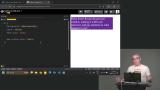 Kevin explains padding and borders in CSS, showing how padding adds space inside an element and how to use shorthand and logical properties. He then demonstrates setting border width, style, and color, including shorthand notation and default behavior.
 Kevin discusses margins in CSS, showing how they add space around elements and how to visualize them in the box model. He highlights the difference between padding and margin and the importance of white space in design.
 Kevin demonstrates how to organize and style homepage content, adding backgrounds, classes, and buttons while covering font, color, padding, hover effects, and the difference between inline and block elements.
 Kevin explains default browser margins, the difference between margin and padding, and demonstrates using auto margins and padding to center elements and maintain proper spacing in layouts.
 Kevin explains collapsing margins in CSS, demonstrating how touching margins merge and cause unexpected spacing, and shows strategies like using padding to prevent it, while also mentioning future CSS solutions like margin trim.
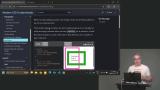 Kevin discusses box sizing in CSS, showing how using border-box ensures elements include padding and borders in their size, and discusses when to use content-box for specific cases.
Backgrounds & Images
Section Duration: 34 minutes
 Kevin explains how to use background images and gradients in CSS, demonstrating control over size, repeat, and position while emphasizing quality and file size considerations.
 Kevin introduces linear, radial, and conic gradients in CSS, demonstrating how angles, color values, and multiple color stops affect their appearance and encouraging exploration of creative gradient effects.
 Kevin shows how to add and style background images on the home page, adjusting size and opacity, and demonstrates using a linear gradient in the footer to enhance the overall design.
 Kevin explains how images behave in CSS, why they need constraints for responsive layouts, and demonstrates how to size them so they adapt while maintaining quality.
 Kevin explains how to organize and name CSS styles, starting generic and refining as needed, and demonstrates refactoring repetitive or overly specific classes into clearer, more reusable patterns.
 Kevin shows why separating wrapper, hero, and content classes prevents layout conflicts, improves reuse, and helps maintain consistent spacing.
 Kevin discusses CSS resets, explaining their historical purpose and modern relevance. He discusses various approaches to CSS resets, emphasizing the importance of starting with a clean slate for styling.
CSS Grid Layout
Section Duration: 1 hour, 3 minutes
 Kevin explains layout modes in CSS, showing how switching display values like flex or grid changes element behavior and creates new contexts that affect how properties work.
 Kevin introduces CSS Grid, demonstrating how to define rows and columns with grid-template-columns and use the fr unit to create flexible layouts where items automatically align and stretch within the grid.
 Kevin demonstrates using CSS Grid with media queries to build responsive layouts, showing how to switch between column structures at different screen sizes for a better experience across devices.
 Kevin introduces spanning in CSS Grid, showing how elements can span multiple columns or rows to create more flexible and visually interesting layouts.
 Kevin introduces alignment and justification in CSS Grid, explaining how items are positioned within grid cells and how the entire grid can be aligned inside its parent using grid alignment properties.
 Kevin discusses CSS Grid Areas, showing how named areas can be used to build responsive layouts while cautioning against reordering content in ways that may impact user experience.
 Kevin demonstrates how to build a responsive card layout using CSS Grid Areas, showing how named areas, alignment tweaks, and media queries work together to rearrange content cleanly across screen sizes.
 Kevin breaks down a complex grid layout, showing how to simplify it by reusing grid structures and avoiding unnecessary rows and columns while highlighting common grid mistakes.
Flexbox Layout
Section Duration: 55 minutes
 Kevin introduces Flexbox and explains how it differs from Grid, showing why it works well for intrinsic, content-driven layouts where items size themselves naturally.
 Kevin explains alignment and justification in Flexbox, focusing on how align items and justify content behave along the main and cross axes and how changing flex direction affects layout.
 Kevin shows how to build a navigation with Flexbox, adding a logo and links, and using justify-content and align-items to space and align elements for different screen sizes.
 Kevin explains Flexbox flex-grow and flex-shrink, showing how they control item sizing and spacing within a container and demonstrating their effect on layout distribution.
 Kevin shows how to simulate justify-self in Flexbox using flex-grow and margins, demonstrating layout adjustments and discussing when separating elements into different containers can help maintain clear, simple code.
 Kevin explains the difference between 1D Flexbox and 2D Grid, showing how Flexbox controls layout in one direction while Grid handles rows and columns, and emphasizes choosing the right method based on the desired structure.
Responsive Layouts
Section Duration: 1 hour, 20 minutes
 Kevin explains responsive layouts, highlighting fluid grids, flexible images, and media queries, and shows how elements adjust across screen sizes using practical examples.
 Kevin explains intrinsic design patterns, showing how sizing values like auto, min-content, max-content, and fit-content affect layouts. He demonstrates practical examples, including a navigation bar that adjusts to content without fixed measurements.
 Kevin explains intrinsic grids, showing how new rows are added automatically as content grows. He demonstrates using grid-template-columns with repeat, autofit, and minmax for flexible columns, and suggests custom properties to simplify and customize the code.
 Kevin explains auto-fit and auto-fill in CSS Grid, showing how auto-fit creates columns for each element while auto-fill adds columns even if empty. He demonstrates how these settings help grids adapt to content and work with Flex for responsive layouts.
 Kevin explains media queries, showing how they adjust layouts based on conditions like screen size. He demonstrates changing Flexbox layouts with media queries and emphasizes ordering styles correctly while keeping queries simple.
 Kevin explains how to choose breakpoints in media queries, highlighting common framework values and the importance of creating breakpoints when layouts break. He emphasizes keeping media queries simple for easier maintenance.
 Kevin explains responsive typography, comparing media queries with intrinsic viewport-based approaches. He demonstrates using Clamp and tools like Utopia to adjust font sizes dynamically for accessibility and better design across screen sizes.
 Kevin introduces container queries, showing how they adjust layouts based on container size rather than screen size. He demonstrates their use, explains the need for defined containers, and highlights their advantages over traditional media queries for creating dynamic, responsive designs.
Positioning
Section Duration: 1 hour, 5 minutes
 Kevin explains CSS positioning, covering static, absolute, fixed, relative, and sticky. He demonstrates position fixed, showing how elements stay attached to the viewport and can be moved with top, bottom, left, and right, highlighting its use for UI elements like navigation bars.
 Kevin explains position sticky, showing how elements stick within their parent container once a point is reached. He demonstrates it with a navigation bar and highlights its limitations compared to position fixed.
 Kevin explains position relative, showing how elements can be moved without affecting surrounding layout. He then covers position absolute, demonstrating how elements position within a parent container and behave in scrolling and layout contexts.
 Kevin guides students through using position absolute in a card layout, explaining the HTML structure and semantic hierarchy. He demonstrates styling techniques, including padding, positioning, and adjusting colors and fonts for quick visual improvements.
 Kevin explains z-index and stacking contexts, showing how elements layer based on z-index values. He demonstrates using position absolute and z-index, discusses common issues with stacking, and shows how isolation can create a new stacking context safely.
Decorations & Effects
Section Duration: 57 minutes
 Kevin introduces box shadows, explaining the key values that control their appearance and how different settings change the result. He also covers using multiple shadows, briefly compares box, text, and drop shadows, and notes performance considerations.
 Kevin explains border radius, showing how different values and shorthand syntax create shapes like pills and circles, and briefly introduces modern features like corner shapes.
 Kevin explains aspect ratio and object-fit, showing how they help maintain image proportions and prevent distortion. He also introduces pseudo-elements, explaining how to create and style them to enhance designs.
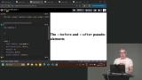 Kevin introduces pseudo-elements, showing how to use before and after to add decorative effects. He also highlights accessibility considerations and how pseudo-elements may be handled by screen readers.
 Kevin demonstrates using pseudo-elements to add visual labels to cards, like tags or badges, while discussing accessibility concerns and practical limitations.
Animation & Interaction
Section Duration: 1 hour, 18 minutes
 Kevin explains the importance of visual feedback in forms and shows how CSS focus styles help users understand which fields are active. He demonstrates techniques like outlines and border changes to improve usability and accessibility during user interaction.
 Kevin explains how user valid and user invalid CSS states provide real-time feedback in form inputs. He demonstrates showing success and error states based on user interaction and how to target specific inputs for better validation styling.
 Kevin introduces the :has selector and shows how to style a fieldset based on its contents. He also demonstrates using accent-color to quickly and accessibly customize form controls.
 Kevin introduces the :has selector and shows how to use it to style required form fields and labels for better accessibility. He also explains key limitations of :has, including why it cannot be nested or chained freely.
 Kevin introduces CSS transitions and animations, showing how to add effects like hover changes and rotations. He explains the transition property, duration, timing functions, and demonstrates using transforms and opacity for smooth, efficient animations.
 Kevin introduces CSS transforms, demonstrating how to use scale, rotate, translate, and skew to manipulate elements. He shows examples of combining transforms and explains why the order of application matters.
 Kevin demonstrates how to animate buttons with CSS, adding hover and active effects. He shows how to adjust transition timing and duration for smooth interactions and explains using the clip property to prevent overflow.
 Kevin introduces CSS animations, explaining keyframes and how they differ from transitions. He demonstrates creating keyframes, applying them with the animation shorthand, and adjusting duration, iteration, direction, and fill mode. Kevin also highlights performance considerations and using dev tools to optimize animations.
Wrapping Up
Section Duration: 2 minutes
 Kevin wraps up the course by encouraging students to practice what they've learned, enhance the second page of a two-page site, and continue their CSS journey.