AnnieCannons
Advanced CSS Layouts

3 hours, 46 minutes
CC

Course Description
For the first time in the history of the web, CSS is graced with tools for laying out web pages without hacks. Flexbox and Grid provide methods for creating responsive websites with designs not previously possible. CSS Calc and CSS Custom Properties give us a first chance to use math and variables within CSS itself, without requiring compiling. Together, these four new CSS modules work together to revolutionize the way we lay out web pages with CSS!
This course and others like it are available as part of our Frontend Masters video subscription.
Preview
CloseCourse Details
Published: September 12, 2019
Rating
Topics
Learn Straight from the Experts Who Shape the Modern Web
Your Path to Senior Developer and Beyond
- 200+ In-depth courses
- 18 Learning Paths
- Industry Leading Experts
- Live Interactive Workshops
Table of Contents
Grid & Flexbox Review
Section Duration: 25 minutes
 Jen Kramer sets expectations for what is covered in Advanced CSS Layouts, and gives a tour of the Github course repository.
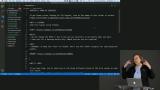 Students are instructed to complete the first exercise, which is a review of both Flexbox, and CSS Grid that includes span syntax, number syntax, and grid area syntax.
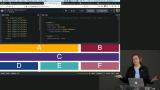 Jen highlights why it's important to separate HTML from CSS from JavaScript into defined roles due to both maintainability and accessibility.
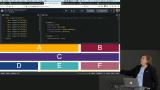 Jen reviews the solution for the Flexbox portion of the exercise.
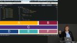 Jen reviews the solutions for the CSS Grid portion exercise that included span syntax, number syntax, and grid area syntax.
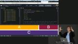 Jen answers a clarifying questions from the audience, then goes on to discuss which method covered in the previous exercise should be chosen by a developer, suggests a resource for further reading on usecases, and foreshadows the discussion of using margin versus justify-content's space-between attribute when utilizing Flexbox.
Pure CSS Off-Canvas Menu
Section Duration: 50 minutes
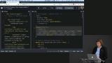
 Jen introduces the Off-Canvas Menu by giving a tour of what the existing code is doing, and adding context for the tools being used for the course.
 Jen adds HTML to incorporate the Off-Canvas Menu into the page.
 Jen demonstrates how to make the Off-Canvas Menu more accessible by adding screen reader directions in the HTML.
 Jen positions the hamburger menu on the page, adds screen reader specific CSS, and creates a color change on hover.
 Jen adds styling to the navigation item container, adds movement to the menu with a transition, and adds styling to both the list and the links.
 Jen uses the :target pseudo-class to apply styles to the menu when the id is selected, then uses an immediate sibling selector to close the menu when another point on the page is selected while the menu is open.
 Jen differentiates the styling for devices larger than mobile by allowing the navigation bar to flow across the page when it's large enough.
CSS Calc() & Custom Properties
Section Duration: 41 minutes
 Jen introduces CSS Calc(), a method to calculate values in CSS. The browser support for the method are discussed, in addition to the benefits and syntax quirks. How to use the method with Sass is also touched on.
 Jen introduces CSS custom properties that work with inheritance and the cascade to allow users to define values that can be used elsewhere in the code. The current browser support is discussed, as well as the syntax for using a custom property.
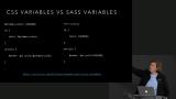 Jen introduces how Sass compiles, then compares it to CSS custom properties. Using a Codepen, Jen demonstrates how scoping affects the ability to declare custom variables, and how this differs from Sass. A discussion is held on when Sass could still be more a appropriate tool than custom properties.
 Jen builds off an original exercise using Flexbox from the course, CSS Grid and Flexbox, by refactoring it to use CSS custom properties and the Calc() method.
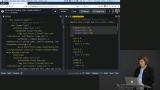 Jen demonstrates the power of custom properties by utilizing the cascade to recalculate the flex-basis based off of the width set on individual columns in the media queries. The gap between the columns and rows is then implemented by applying another custom property that calculates itself based on the other custom properties.
 Jen reviews what was accomplished by refactoring the layout with custom properties and the CSS Calc() method.
Complex Layouts
Section Duration: 35 minutes
 Jen introduces the home page exercise, which is a real-life application of custom properties and the CSS Calc() method to a webpage with more a more complex grid layout.
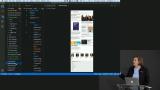 Jen breaks down the problem by pointing out the specific patterns that occur in the HTML code, then uses this to write the CSS that utilizes the custom properties from the previous example. It's also demonstrated how to insert default values into custom properties as a fallback. Once the general selector's custom properties are set, Jen completes the largest media query, and fixes the gap calculation to be nicer to look at on the page.
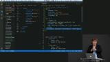 Jen demonstrates how to use the custom width property and ordering to have a column reorder itself underneath the other columns with very few lines of code. Students are instructed to attempt the last media query by themselves before continuing.
 Jen demonstrates how to target items within an element using the custom properties that were already written to lay out differently when the breakpoints on the page are reached.
 Students are instructed to use custom properties and CSS Calc() to create a webpage matching an example image from starter code in chapter 5 of the course repository.
 Jen reviews a possible solution to the article layout exercise.
Font Sizes
Section Duration: 26 minutes
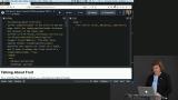
 Jen introduces the problem of how to choose type that scales well, then navigates to a website called Type Scale that calculates the a family of sizes based on factors such as the base size, font, scale, and weight.
 Jen addresses type sizes with CSS Calc() and custom properties to demonstrate how to utilize both to quickly and effectively change the type scale between mobile and desktop with far less code.
 Students are instructed to adjust the type on the home page to match an example image from the starter code in chapter 8 the course repository.
 Jen reviews a possible solution to the type scale exercise.
Tables & Forms
Section Duration: 41 minutes
 Jen briefly reviews the standard HTML of a table, then adds basic HTML elements such as a caption, head of the table, and accessibility attributes to
 Jen adds a screen reader and the accessibility requirements associated with it, then adds table borders and differentiates the rows with color.
 Jen uses a double colon followed by a "before" or "after" keyword that creates a pseudo-element that is the first or last child of the selected element. The pseudo-elements are used to create labels and units on the table items.
 Jen constructs the styling for the title of the table, then constructs a media query that makes the table more readable.
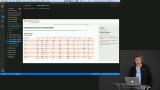 Students are instructed to recreate a table from the starter code, and the images given in chapter 10 of the course repository. The key to the exercise is to combine the page and table layouts so that they both work correctly. Students must override some of the layout settings in this challenge.
 Jen reviews a possible solution to the responsive tables layout exercise.
 Students are instructed to recreate a form using the starter code and provided example images in chapter 11 of the course repository. To complete the exercise, ideas of how to structure the HTML in pattern, flexbox, custom properties, Calc(), and other concepts are all utilized.
 Jen reviews a possible solution to the responsive forms exercise.
Wrapping Up
Section Duration: 4 minutes
 Jen wraps up the course by discussing the limitations to the techniques discussed today, why the theme of today has been the death of Bootstrap, why Bootstrap may still be useful, and a review of why the techniques learned in the course are useful. Jen takes questions from the audience on further resources for learning, and whether moving concerns such as margin and padding to the CSS is better than the utility classes in Bootstrap.
Learn Straight from the Experts Who Shape the Modern Web
- In-depth Courses
- Industry Leading Experts
- Learning Paths
- Live Interactive Workshops