Tailwind CSS

Steve Kinney

Steve Kinney

Temporal
4 hours, 10 minutes CC
Tailwind CSS

Course Description

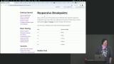
Use Tailwind CSS's utility-first approach to build out entire web designs without needing any custom CSS! You can even add responsive breakpoints and dark mode right into your HTML markup. Learn through hands-on exercises building real-world components like modals, forms, and page layouts. You’ll then configure Tailwind to theme your projects and harness its layers for concise, maintainable styles. By the end of this course, you'll be proficient in building visually stunning, responsive, and maintainable user interfaces with Tailwind CSS!

This course and others like it are available as part of our Frontend Masters video subscription.

Preview
Close

Course Details

Published: December 13, 2023

Learning Paths

Learn Straight from the Experts Who Shape the Modern Web

Your Path to Senior Developer and Beyond
  • 200+ In-depth courses
  • 18 Learning Paths
  • Industry Leading Experts
  • Live Interactive Workshops
Get Unlimited Access Now

Table of Contents

Introduction

Section Duration: 6 minutes
  • Introduction
    Steve Kinney introduces Tailwind CSS and discusses discovering Tailwind CSS as a solution for writing CSS more efficiently. Tailwind CSS is a utility-first CSS framework classes that can be composed to build any design, directly in markup. The Tailwind CSS playground will be used to code and test the exercises throughout the course.

Basic Styling

Section Duration: 1 hour, 18 minutes
  • What is Tailwind CSS
    Steve explains the purpose of a utility-first CSS framework like Tailwind CSS. Tailwind CSS can increase productivity and the ability to add customizations. Questions about using Tailwind, including the level of CSS knowledge required and how it compares to other CSS libraries, are also addressed in this lesson.
  • Utility First CSS & Layers
    Steve discusses the basics of Tailwind CSS and explains its philosophy. The Tailwind CSS playground is helpful for experimentation, and the course website provides information about tools like Tailwind IntelliSense and Prettier. CSS layers are introduced and help encapsulate styles and manage specificity. Tailwind CSS ships with a base, components, and utilities layer.
  • Base Styles
    Steve demonstrates the base styles within Tailwind and how to add core styles to the base layer using utility classes and the @apply function. Using a theme in Tailwind CSS, including using predefined colors and creating custom color classes, is also covered in this lesson.
  • Theming & Named Colors
    Steve explains how to customize the color theme in Tailwind CSS. The default theme can be extended with new colors and shades of colors. The custom theme colors can be used in custom CSS classes or to override the existing primary and secondary colors. The lesson emphasizes the flexibility and extensibility of Tailwind CSS in terms of color customization.
  • Styling & Customizing Spacing
    Steve customizes a button with various properties such as background color, text color, padding, border, shadow, and rounding corners. Arbitrary values and measurements can be used by wrapping them in square brackets. Text sizing and spacing are also explained.
  • Styling a Modal Exercise
    Students are instructed to style an alert/modal dialog that contains text and two buttons.
  • Spacing & Dividing
    Steve explains how utility classes can easily add background colors, spacing, and other styles to elements without writing custom CSS. Composing multiple utility classes together can create custom utilities.
  • Spacing & Dividing Exercise
    Students are instructed to use the spacing utility classes to separate menu items.

Variants

Section Duration: 1 hour, 34 minutes

Layout

Section Duration: 47 minutes
  • Columns
    Steve introduces the columns property, which is helpful for masonry layouts or multi-column text layouts. Options for controlling the columns include specifying the number of columns or the width of each column. Aspect ratios for images are also discussed in this lesson.
  • Columns Exercise
    Students are instructed to use the the columns class to create a multi-column layout.
  • Flexbox
    Steve introduces the Flexbox and Grid classes in Tailwind CSS and uses a playground to demonstrate the Flexbox classes. By default, the horizontal axis for layout is the main axis, and the vertical axis is the cross axis.
  • Flexbox Exercise
    Students are instructed to use the Flexbox classes in Tailwind CSS to create horizontal and vertical layouts. Breakpoints should be added to adjust the design across different viewports.
  • Grid
    Steve explores the grid classes in Tailwind CSS and compares them with the Flexbox classes. The grid playground is used to experiment with the layout classes justify, align, place, content, and items.
  • Creating a Page Layout
    Steve demonstrates how to create a grid layout using Tailwind CSS. The HTML structure uses header, sidebar, main, and footer elements. CSS grid properties like grid-template-rows and grid-template-columns are applied, and Tailwind's responsive breakpoints are used to adjust the layout for different screen sizes.

Additional Tailwind CSS Features

Section Duration: 14 minutes
  • Animations & Useful Tricks
    Steve demonstrates the pre-defined animation classes like a pulse for creating loading indicators or notifications. The animation classes can be combined with transitions and transforms to display indicators based on an empty state. Copying content and screen reader-specific classes are also demonstrated in this lesson.
  • Plugins
    Steve explains that plugins in Tailwind CSS are a way to package up functionality that can be added to the build system. Typography and container query plugins are demonstrated. Tailwind CSS configuration for plugins is also explained in this lesson.

Wrapping Up

Section Duration: 9 minutes
  • Wrapping Up
    Steve wraps up the course by answering Tailwind CSS questions, including important features, considerations for building for production, tools in the Tailwind ecosystem, building a custom design system with Tailwind CSS and Figma, using CSS variables, and handling scrolling panels within a grid container.

Learn Straight from the Experts Who Shape the Modern Web

  • In-depth Courses
  • Industry Leading Experts
  • Learning Paths
  • Live Interactive Workshops
Get Unlimited Access Now