
Jen Kramer
AnnieCannons
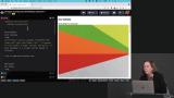
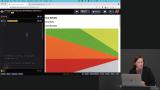
Learn the essential CSS layout techniques for building responsive, beautiful web applications. You'll get hands-on practice using CSS Grid for two-dimensional, grid-based layouts and Flexbox for styling one-directional flow. You'll master using these techniques together along with responsive images to build real-world, responsive web layouts!
This course and others like it are available as part of our Frontend Masters video subscription.


I just completed "CSS Grid & Flexbox for Responsive Layouts, v2" by Jen Kramer on Frontend Masters! Lots of great info on Grid, Flexbox, and Responsive layouts in this course! An awesome intro to these concepts. I can't wait to practice and learn more.

Andy Glover dev
andygloverdev
This was totally mind blowing and learned a lot about layouts. Got some cool inspirations for designs.

Sunny
sunnykrsh